Soundaware M1 Esther

Bansaku

1000+ Head-Fier
Pros: Beautifully natural and transparent sound that is near perfection! Stunning design and build quality.
Cons: Sadly the price is to high for my current budget...
 
Soundaware Esther M1Pro and Analogue: Pure Music Bliss
 
 
front.jpg
 
 
Introduction
 
Portable music devices have been cemented into our daily lives for nearly 60 years. The cutting of the cord was born with the Regency TR-1 transistor radio, solidified with the Sony TPS-L2 Walkman, and perfected with the game changing Apple iPod. Nowadays, thanks to the advent of the Smart Phone, virtually everyone has the ability to enjoy their music anywhere and at any time. Gone are the days of the stand-alone music player, the all-in-one/always online/app driven/selfie taking smart device now rein supreme. While convenient as these devices are, there is a trade off to cramming in so much technology into an ever shrinking design; Jack of all trades, master of none. While the general user is seemingly willing to trade off overall quality with a mindset of “it’s good enough”, in the world of audio enthusiasts this approach simply will no do.
 
The Soundaware Esther M1 line-up of portable digital audio players, or DAP, is the antithesis to todays smart-phones. With homage to the original Apple iPod, the Esther M1 embodies the philosophy of having the absolute best possible audiophile sound rivalling the quality of a stand-alone desktop solution wrapped up in a portable package no bigger than a standard deck of playing cards.
 
Disclaimer
 
Soundaware provided me with the Esther M1 analogue and M1Pro as part of the North American Review Tour. I was given 2 weeks to demo the units before I sent them off to the next member of the tour, and was in no way compensated for my words. This review is objective and honest, free of bias.
 
About Me
 
38 years old, I grew up in a family consisting of musicians, broadcaster/sound engineers, and amateur DJs, I always had a deep appreciation and understanding of both music and sound. I was further educated in this self interest after taking courses in both electronics and sound (Electro-Acousto aka The Path to Golden Ears). While I believe a listener’s preference in sound is subjective, the science behind it is not. I am not swayed by buzzwords, hype, trends, brand recognition, or big numbers on charts; I am the nemesis of the commissioned salesperson. Opinionated as I am, my words are not only objective but honest. I view all criticism as constructive, as long as it is sincere. 
 
Headphones used in testing:
PSB M4U 1 |  Meze 99 Classics | Grado SR60i | Polk Nu Voe | Shure SRH440 
AKG - Q701 K240 Monitor 600Ohm  
Sennheiser - HD 600 / HD 598 / Momentum
 
Specifications
 
  1. Size: 115mm * 59mm, the thinnest thickness of 14mm, holding thickness about 15mm
  2. Weight: about 175g
  3. CS5398 DAC
  4. 6 Layer gold-plating PCB
  5. Ultra low noise crystal oscillator
  6. Dual Femtosecond FPGA Clocks (M1 Pro)
  7. Sampling rate: 32khz-192khz, DSD (SACD)
  8. Format: MP3, WMA, AAC, ALAC, M4A, CUE, WAV, FLAC, APE, ISO, DSF, DFF etc.
  9. Storage: TF * 2 (single maximum support 128GB, future support will be greater), NTFS, FAT format
  10. Playback time: normal listening about 9 hours
  11. Line Output: 1.4V RMS
  12. Coaxial output: 0.5V p-p, PCM & DSD (DOP)
  13. Screen: 2.4 inch high resolution Sharp IPS hard screen
  14. Distortion + Noise (headphone output): <= 0.002% (44.1khz, 1khz DS3)
  15. Dynamic ratio (headphone output):> = 110db.
  16. Background noise (headphone output): <=-130db.
  17. Amp analog output: 2.8V RMS highest, 97% volume output, distortion <= 0.003%, desktop class AB amp circuits, power output, third gear gain
  18. 16 - 300 Ohm recommended headphone impedance
 
Simply by reading over the listed specifications, how can one not be utterly impressed! Of course, numbers tell only a small story, can be misleading, and may not be indicative of the units actual performance. Does the Esther M1 hold up to Soundaware’s claims? One word: Absolutely!
 
The Package
 
 
frontbox.jpg    sidebox.jpg


As someone who has been in warehousing and manufacturing all my working life, I personally subscribe to the philosophy of ‘ It is telling of a company’s commitment to quality the moment the customer opens the box. ‘ and Soundaware recognizes and understands this way of thinking. Upon gazing at the Esther’s box, Soundaware truly make one feel like they have received a premium product. A nice faux leather burgundy skin is accented by gold leaf lettering, and the main unit and accessories sit nicely in place the in their sturdy slotted velvet lined box. Although not pictured, even the box’s lid has a rather thick foam pad lining to the underside, ensuring that nothing gets jostled inside the box. This was a nice change to what I am used to when unboxing, which usually amounts to plain white cardboard, plastic blisters, and packing foam held in place by plastic ties. 
 
Inside the box Soundaware includes all accessories needed for complete functionality and compatibility. 
 
 
accessories.jpg  skin.jpg
 
 
- Esther M1 body
- TF card
- USB charging cable
- Micro SD USB card reader
- User manual
- Rubber pad *
- Paper with fast user manual
* I did not receive with my review units
 
What is interesting was that I received a couple extra goodies not listed. The first was a rather nice quality 3.5mm to RCA digital coaxial cable. This was not a standard pack-in. Given the quality of the cable and my need for one this was a pleasant surprise. The second unlisted item was a sheet containing a stick-on vinyl skin! Nice! Although I did not actually stick them on, their texture and quality of the adhesive seemed like they would both protect well while being rugged enough to not wear off. In all honesty, it was very very difficult for me, as a child of the 1980’s, to not go all G.I. Joe/Transformers and put the stickers on the Esther! I almost did, for the sake of science (and the review), but instead I found images from the user @shield that show what the M1 looks like all decked out in sticker goodness!
 
stickersf.jpgstickersb.jpg
 
 
Design
 
As the saying goes, “ A picture speaks a thousand words. “, so I will leave all the describing to your eyes. 
 
  tilt.jpg 
anglefront.jpg
 
 front2.jpg back.jpg
 
side.jpg
 
 
Overall, I found the design of the Esther M1 to be both functional and elegant. The unit is both small enough and light enough to carry around without feeling like their is a brick in my pocket. I actually appreciate the slightly beveled screen as well as raised face buttons that give a nice tactile feel, which in turn helps finding the orientation of the device. While out and about I had no trouble reaching into my pocket and easily changing finding the buttons to change track or raise the volume.
 
The Sound
 
The Esther M1 is a true class AB DAP. Making use of hand pickled boutique components, coupled with the very capable CS5398 DAC, the M1 faithfully reproduces the music with great detail and clarity without the often criticized sharpness that a class D device would typically produce. While the analogue sound smooths over the sharp peaks it does so without any loss of detail. For those who are familiar with tube amps and buffers, the M1 offers a very similar sound, but without any discernible colouration or distortion. I would describe it as standing on a hot beach in the tropics with a cool breeze blowing across your body, or for people such as myself that hail from the North, sitting in an outdoor hot tub in January. In other words, a perfect balance of warmth with the right amount of crispness.
 
The sound.. what can I say about the sound… so many words in the English language to choose from! Smooth, liquid, detailed, expansive, warm yet crisp, highly resolving, emotion, engaging, musical bliss, pure uncoloured analogue perfection! I have purchased many portable digital audio players over the years ranging from expensive CD players, flash drive/ card based, CD-ROM and early HD models, cheap dollar store iPod wannabes, and every iteration of iPod/iPod touch. Last year I even spend a full day demoing FiiO and Sony DAPs and portable amps ranging from $99 to $600 CND, walking away empty handed as I felt their price and overall sound didn’t warrant an upgrade from my 6th Gen. iPod touch. Until the Esther M1, I never thought it was possible to produce such wonderful sound out of any portable device, especially one that rivals many high end desktop solutions!
 
In terms of frequency response, the M1 does not add nor take away. To my ears, I would describe it as as flat as flat can get. It really is no different that what I hear out of my iPod and iPod touch, which is great as iDevices are known for their uncoloured, neutral output. Despite sharing a flat response, the differences end there; The M1 utterly destroys the iPod (and most everything else in it’s class) in terms of transparency and resolve! The M1 gives an excellent sense of scale and layering. It mattered not if I was listening to my Momentums or my HD 600, the M1’s ability to render the finer details was impressive! From the subtlest whispers of a choir, to the excitement of heavy metal transients, the M1’s grip on the sound was absolute!
 
What really impressed me the perfectly black the background! As mentioned, I am no stranger to DAPs. It’s almost a given that a cheap throwaway player will undoubtedly produce a hiss, especially at higher volumes. What surprised me was just how noisy both my SoundBlaster E3 and iPods were! I thought both were pretty silent. I could not hear any discernible hiss at any volume level, even with my IEMs. That all changed when I played a ‘ digital pure black test track ‘ through all my devices and cranked the volume. I was shocked at what I heard, even on my iFi stack; Faint noise… Though under normal listening conditions I would not normally hear any noise, and would consider their backgrounds to be pretty black. Playing the same file with the M1 produced absolutely zero noise. It mattered not if the volume was 1 or 100, it was as if the device was powered off! Coloured me impressed! Now to be honest, I had never done this test before as I never knew such a test file existed until recently, so this was rather new to me. The revelation was a real eye opener! 
 
I am not sure what more I can put to words. Unlike headphones, a DAP is supposed to sound only one way; Correct. There is no sense covering things like the finer details of the mids or the overall size of the soundstage as these points will change from headphone to headphone. All I can tell you is that the Esther M1 reproduces music with such authority, clarity, transparency, blackness, and emotion, it allows the listener to experience the finer details that make up each song and accomplishes what the artists set out to do; Touch the listener’s inner soul!
 
M1Pro vs M1 Analogue
 
The only difference between the Ether M1Pro and the M1 Analogue besides some higher quality capacitors is the Dual Femtosecond FPGA Clocks present in the former. This accounts for the $180 difference is price between the two, but is it really worth the added cost? Absolutely! While both devices share 95% of the internal circuitry, they don’t share 95% of the sound. Their sound is extremely close, including overall refinement, the M1Pro does possess greater overall transparency. A good analogy would be listening to the M1 Analogue would be akin to looking out through a perfectly transparent and flawless pane of glass, the type that bumbling dads and magpies crash into in a Windex commercial. The M1Pro would be like removing the glass all together, exposing the breeze and rays of sun. Listening to the M1 Analogue first, I was blown away with the sound I was hearing compared to my iPod (and to a lesser extent, my iFi stack). If that was the only unit I had I would be more than content with the sound. However, once I moved on to the M1Pro, there was simply no turning back. The layers of invisible grain were pulled away, exposing a greater sense of life and realism in the recordings. 
 
Software/Firmware
 
Love it or hate it, the software of the Esther can be describes as to-the-point. It is a familiar design of basic contextual menus each containing sub-categories. If you have used an old iPod, you would feel quite at home using the M1’s interface. There is nothing fancy, no bling, no bells or whistles, just what is needed and nothing more. Personally, I absolutely love the interface. It’s simple, it doesn’t require a high learning curve nor does it overcomplicate, and most important very easy navigation.
 
Moving from one category to the next and from within the contextual itself is easily done so using the track forward/back buttons and the up/down arrows, with the play/pause button being the ‘action’ button; To exit out of a category and go back one section is accomplished by hitting the ‘return arrow’ (the top left button with the half looped arrow). However if the user wishes to return back to the current playing song it is as easy as hitting ‘M’  button (which I assume means Menu/Music), and vice versa to return to the last used menu. I appreciate this feature as it alleviates the need to constantly back in and out of the menus one screen at a time. Overall, the navigation was snappy with no discernible delay. Controls were responsive, and thanks to the tactile feedback of the bottoms, easy to pull off.
 
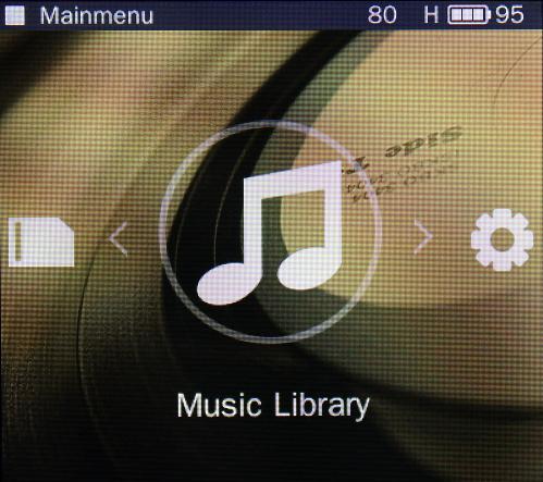
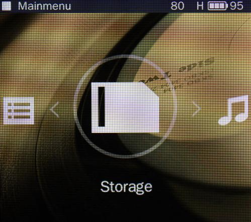
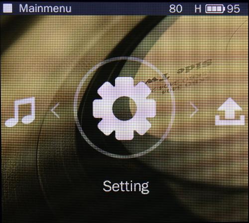
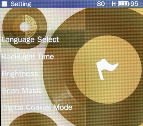
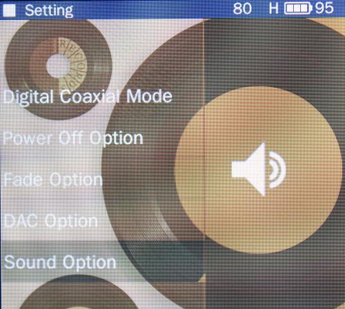
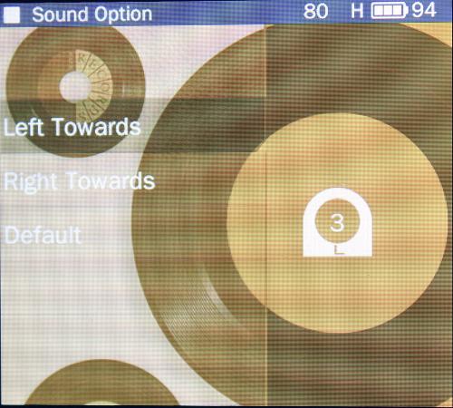
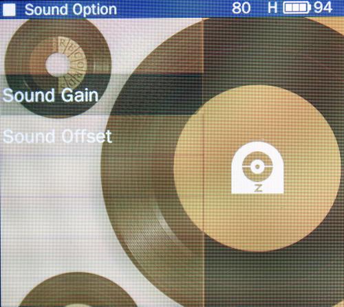
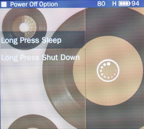
The pictures below show each category and sub category. They are all self explanatory, so much so that I will not be going over each individual one. If you have a basic understanding of your language, you will have absolutely no issues figuring out what each selection does. Kudos for Soundaware for making things very easy and straight forward to understand.
 
display.jpg 
about.jpg list.jpg
 
musiclib.jpg playing.jpg 
storage.jpg upgrade.jpg 
settings.jpg settingssub.jpg
 
settingssub2.jpg dac.jpg 
gain.jpg sound.jpg 
sound2.jpg poweroff4.jpg
poweroff3.jpg poweroff.jpg
 poweroff2.jpg
 
 
File compatibility was as listed. No matter what file type I threw at the Esther, it played without a hitch. However, not all files are created equal! I did have some issues playing certain Apple Lossless files (ALAC). Depending on what programs were used to encode the file (i.e. iTunes vs XLD), some ALAC simply would not play. In fact, they would not only refuse to play, they would crash the M1 causing the unit to reboot! Besides, ALAC not playing, it seems depending on the file type, ID3 tags and album artwork refused to show. This mostly affects AIFF and WAVE files, with MP3 and certain FLAC displaying their tags and art correctly. Adding to this inconvenience, gapless tracks/albums were played with gaps. Not an issue really, more of an annoyance for some. Personally, the gap between tracks did not bother me nor distract from my listening experience as my gapless albums mostly consist of 4-5 very long songs.
 
In terms of software stability, I found the Esther to be incredibly solid and reliable. While both the M1Pro and Analogue had a few snags along the way, it really was my own fault for pushing the device. Under normal listening sessions ranging from a few minutes to hours, not once did the Esther crash, hang, or reboot unexpectedly. It wasn’t until I was rapidly switching songs, all 24/96 or better, on random, that either of the M1’s crashed. From my experience with technology, in my enthusiast opinion, this wasn’t so much a problem with the software or hardware of the Esther, rather the quality of the supplied microSD card. It simply could not handle the data rate at which I was pushing, and as a result, the M1 couldn’t cope.
 
One annoying issue I came across that I personally dislike is the fact that when the screen is powered off, one must double tap the controls, with a delay between taps, if one wishes to change tracks. The first tap is to essentially wake the screen, the second tap actually does what the user is wanting in the first place. I find this very annoying as habit has taught me that only one tap is needed for virtually every other digital music player I have used over the past 20 years. If there was one issue that I personally think needs addressing before all others, it is this. Granted, the device drains so little power with the screen on, it is just as easy to have the screen at a lower brightness and keep it set to always active. However, given that this is an odd behaviour it really should be remedied.
 
Overall, I found the software/firmware of the Esther M1 to be quite satisfactory. Sure, there are a few snags and niggles, but what software doesn’t? Most of the issues could easily be resolved with a much needed firmware update, one that Soundaware is currently issuing to the reviewers on the tour. Unfortunately I received the update just as my time was up and needed to ship off the units too the next member on the list before I could install and test the new software. Regardless, if I were to purchase an Esther M1, I would personally be fine with the firmware if it was the same that was installed on my review units.
 
Power Output
 
Soundaware recommends using the M1 with headphones and IEMs ranging from 16 - 300 Ohms, which pretty much has everyone covered. Included in the software options is the ability to change the power output from Low, Medium, and High. After testing all three settings, I have come to the conclusion that the first two are not needed. The volume stepping is in 1% increments, so fine tuning the volume to match your headphone’s impedance is simple enough, negating the need for the lower settings all together. It mattered not if it was my Polk BA drivers, Apple EarPods, or my HD 600, high gain proved to work well providing proper amplification gain with no discernible hiss.
 
The M1 provided enough power to drive every headphone in my inventory, including my 600 Ohm AKG 240 Monitors to satisfactory levels. However, the output impedance of the Ether is listed at 10 Ohms, far greater than what I am used to with my iPod touch (1.4 Ohms) and my iFi iCan micro SE (virtually 0 Ohms). This of course can cause issues in the form of frequency attenuation or distortion in lower impedance and sensitive headphones. While I don’t have any super sensitive headphones, my Polk Nue Voe would be the closest thing. Their sound signature is very warm, so I was concerned that the M1 would kill off some of the treble, and it did. Upon listening I could hear right away that what little sparkle and shine they did have was in fact diminished. Not to the point of gone all together, but enough to be noticeable. In regards to my full sized on-ear headphones, their performance was spot on, with no discernible changes in their overall frequency response. Essentially, they all sounded like they should. The M1 provided enough power to make them all sing, driving them to defining levels without distortion.
 
However, there were two headphones to note due to their unexpected behaviour; The AKG Q701 (62 Ohm) and the PSB M4U 1 (32 Ohm). The Q701, having neutral bass, seemed to have lost a a dB  or two in it’s response. I wouldn’t call it thin sounding, but given the class AB design and overall warm analogue sound of the M1, I assumed that out of all my headphones, the Q701 would benefit more in the low end, but instead it softened it! In regards to my M4U 1, the exact opposite occurred! The PSBs have great bass extension that is north of neutral, and their control on the low end is masterfully done; No bloat, no strong internal resonance, as fast as greased lightening. No matter what type of bass boost I apply, I just can’t get any looseness out of the lower end what so ever! When listening to the PSB with the M1, it blew my mind how much of a lush increase in bass I was hearing! Detailed, controlled, layered, yet somehow the M1 gave them not only a harder slam, but a bit of analogue elastic-like looseness that made everything that much more enjoyable! This alone would sway my purchase towards an M1 over the competition! But like most headphones, and one’s own ears, YMMV!
 
Connectivity
 
 
bottoms.jpg


The Esther M1 provides the user with 3 different ways to connect the device via 3.5mm jacks: Headphones out, Line out, and Digital Coaxial out, all with jack detection. Headphone out is pretty self evident, so I won’t bother covering this. Line out works as it should, and sounds fantastic playing through my iCan micro SE! I must say whether it was M1—>iCan—>headphones or iDAC—>iCan—>headphones, the stand alone M1 gave my iFi stack a run for it’s money! The only issue I have with line out is that it is still dependant on volume. Soundaware recommends setting the volume to 90% for line out for most devices to prevent distortion. I can see the logic in this method as not all amplifiers have a consistent input voltage, so having the ability to fine tune to your device is a welcome addition. Personally, I would prefer it that the software automatically sets the volume to 90%, and lets the user fine tune after the fact.
 
Digital Coaxial output works as expected. I had no issues by simply connecting the M1 to my Yamaha receiver, selecting the right input, and pressing play. What surprised me is that using the M1 as a transport device via coax produced a much cleaner, more transparent sound than connecting my Yamaha to my computer via TosLink. A good comparison would be a 1080P video playing through a Component Video cable vs an HDMI. The sound is much warmer, more lush, more natural texture and a nice smoothing over of the digital sharpness! In essence it became more natural to my ears, regardless of the fact that it was the AKM DAC inside the receiver doing the work and not the M1. I often have read that this is simply indicative of COAX vs TosLink, and now that I have experienced the difference first hand, call me a believer!
 
Battery Performance
 
Soundaware claims up to 9 hours of playback for normal listening. I can only conclude that “normal listening” refers to how one would go about using the M1 throughout their day at moderate volume levels with a pair of 32 Ohm headphones. My personal experience concurs with their claim. I was able to squeeze out 8-9 hours of playback playing only lossless AIFF ranging from the standard 16/44 to 24/192 with a few DSD albums thrown in the mix. What surprised me the most was the fact that whether the display was active or not the drain on the battery was virtually identical. Over the source of 4 hours I had the M1Pro and M1 Analogue playing side by side, one with the display active and the other not, and the results of the battery drain were within 5% of each other!  I guess you can say OLED FTW!
 
While battery performance during playback was great, the M1 does have some quirks. Firstly, when in standby mode, the drain on the battery is substantial. With a full charge, the M1 in standby mode will drain the battery by 60% if left overnight! Of course one can remedy this by either plugging in the unit when not in use, a habit we all have become accustomed to thanks to our smart phones, or simply powering the device off. The second quirk is that Soundaware recommends you have the M1 attached via USB when powering on the device from a power down option, with the actual device warning you to do so when choosing the option from the menu. Honestly, I often forgot and had no issues powering on the M1 from a shutdown without the deice connected via USB.
 
Value
 
Priced at $520 for the Esther M1 Analogue and $700 for the Esther M1Pro, these DAP are not for the average consumer looking to simply “play music”, instead they are geared towards the audio enthusiast who wants an audiophile sound in a portable device. They way I tend to look at pricing vs needs can be compared to a commuter choosing to purchase a Kia rather than a Cadillac. Both vehicles will get you from point A to point B, the difference being one will get you there with total performance and comfort. Not everyone cares about lossless HighRez and DSD let alone paying out the cost of an average smartphone just to play music in which the latter does, and more. However, there are many out there who want the absolute best sound, and dropping $500+ to achieve this goal is not unreasonable; The Esther M1 are for these people.
 
Conclusion 
 
I must say, two weeks to demo the Esther M1Pro and analogue went by much too quickly. As the saying goes, “ Once you hear something, one can never un-hear it! “ and compared to my iPods, the Esther’s are the epitome of that statement. Simply put, I never thought it possible to squeeze so much audio goodness into such a small and attractive package. Despite some software quirks, I can not find a negative to say about either the M1Pro nor Analogue. Small and light weight, battery performance “as advertised”, simple and easy to use UI, and an absolutely gorgeous and amazing listening experience, Soundaware set the bar for what I look for in a DAP. It is unfortunate that given my current financial situation, by the time I can afford an Esther M1Pro or Analogue both will be antiquated, but I do thank Soundaware for giving me the opportunity to experience  not only what you have to offer, but redefine what I though was possible in a small and attractive device. I would whole-heartedly recommend to anyone looking to experience the absolute best sound possible in a portable device where price is not an issue to look no further than the Soundaware Esther M1Pro or Analogue.


ambchang

500+ Head-Fier
Pros: Great details, balanced, great sound stage
Cons: Questionable usability

Disclaimer:  I received the Soundaware Esther M1 and Esther M1 Pro for the duration of 1 week as part of a review tour for my honest opinion.
 
Gear:
I primarily used my iBasso iT03 during the listen, but also used my full aluminum magnum v4 build, modded Fostex T50-RP, and VE Monk.
I compared this mostly to my xDuoo x3.
 
Sound preference: 
Over the years, I find that I tend to like sounds that border on the bright side, with clear mids and thump in the bass (not necessarily quantity, but that thump).  For reference, I loved the Tralucent 1P2, Hifiman HE6, and Stax SR007 (who doesn't?), but also found the JVC HA-FX850, Westone UM2, UM Mentor, UM MIracle to be phenomenal phones.  On the other hand, well reviewed phones like the JH audio Roxanne, Shure SE535, and Westone UM3RC are just not my cup of tea.
 
Music used:
I used a list of 58 songs for casual listening (all apple loseless), but focused on the following few tracks:
1) Norah Jones – Don’t know why, Come away with me (For female vocals)
2) Radiohead - National Anthem, Kid A (for pacing and bass response)
3) Kid Rock – Bawitdaba, Devil without a cause (for poorly recorded music, especially the part when all those cymbals came in at the beginning)
4) White Stripes – Black Math, Elephant (For distorted sounds)
5) Buena Vista Social Club – Chan Chan (For pacing, rhythm, and spacing)
6)  Snare Liftoff – Whiplash Soundtrack (for rhythm)

What I look for:
You can look at the many other reviews for photos, un-boxing, accessories, packaging, etc ... quite frankly, I don’t really care about those things.  A player can look like the hunchback of notre dame, it can come in a plastic bag, and it can come with bare accessories, but I wouldn’t care as long as:
1)      It sounds great
2)      It’s useable/intuitive
Methodology:
I did not use any burn-in as I assumed that the units are well burned in before reaching me.  I spent 4 days with the M1, and another 3 days with the M1PRO.  I wanted to say that I went with the M1 first because I want to experience the base version before “moving up” to a higher model to notice the difference, but the truth is, the units were placed in the wrong box and I ended up with the M1 instead of the M1 Pro instead.  It worked out.
I first loaded all the music I had from two 128GB microSD cards to try and see how well it handed large volumes of data.  It didn’t.  The reading took a long time (I had to leave it on overnight), and even then, only parts of the music was loaded into the database correctly.  I can still browse by file, but I can’t sort by Artist/Album/etc ....
I then loaded my test music in a 1GB microSD card, and loaded that in the unit.  It still took a good minute or two despite the extremely small number of files.
So my first thought is that the unit can use some stronger processing power to handle filing functionality.
 
Usability/Ergonomics:
The player buttons were well laid out, and the buttons are intuitively laid out. The player is light, but is of a good size where I imagine it would fit into most people’s palms comfortably.  It appears to be solidly built, but the parts appear quite cheap (again, don’t really care as long as it lasts, which I can’t tell without owning the unit for months and months).
The user interface is simple, and basic.  Functions are limited, but all the essentials are there.  I major grip I have with it is that if you do not turn off the unit, the battery drains quickly (gone overnight), but if you do turn on the unit, it no longer remembers where your last song stopped, and you had to start all over.
Random play is odd in the sense that you had to choose the song you have to play first, and then the songs after the first song will be randomly chosen.  In other words, I can’t find a way to randomly play a playlist from the start.  It’s not a huge deal, but it’s just odd.
Battery life is great once you figure out you have to turn the unit off.  It would last me a few days of continuously listening.  I didn’t time the battery life, but I estimate that it was easily 10 hours of listening time.
Regrettably, I didn’t have the time to test the coaxial cable out, but I did manage to test out both the line out and the headphones.
Finally, an issue I had with the player is that it doesn’t seem to support gapless playback.  It also appears that it cuts off the last split second of a track before moving onto a new one.

Sound:
What can I say?  This is simply a phenomenal player.  The sound is balanced, open, airy, great pace, and just smooth overall.  This applies to both the M1 and M1 PRO.
Compared to my xDuoo x3 lined out to the Meier Audio Quickstep, the openness and the sound stage of the unit really shines through.  The highs are detailed without being harsh, the mids are smooth and well-rendered, and the bass is impactful without being over-bearing.  It is simply one of the best sounding DAPs I have ever heard (not that experienced, but still ...).  The sound itself most certain justifies their asking price.
I find the improvement from the M1 to the M1 PRO to be more subtle than the improvement from the xDuoo x3 to the M1.  The clarity appears to improve, the pacing seems to be better, and there seems to be more clarity.  The changes are really subtle, and I am not going to pretend it may not be due to my preconceived expectations influencing the results.
I also tried playing the lineout to my Meier Audio QuickStep, and I felt the sound to actually get worse.  The soundstage collapsed, the output just seems more lifeless.  Keep in mind that I have a very high regard for the QuickStep, I have cycled through my share of highly regarded mid-fi portable amps, and settled with the QuickStep, so it was a huge surprise that the internal amp of the M1 and M1PRO seems to be considerably better than the QuickStep.
 
Conclusion:
Sound-wise, I really have no doubt that this is a top notch player.  It really sounds superb, and I can listen to the player for days without fatigue, nor will I be bored with it.
That said, my suggestion to Soundaware is to really look into the user interface, and either adopt Rockbox, an Android based interface, or improve on the current UI.  This player can easily play with the big boys if more attention is paid to the usability aspect.
  • Like
Reactions: Stahlreich

tassardar

500+ Head-Fier
Pros: Wide Open sound, Musical, Detailed
Cons: Dated Interface, Cant read a few file types, Weird Navigational Choices, Things may sound a little distant, Short battery life
Photo6-12-16124812PM.jpg
 
 
The Soundaware Esther M1Pro provides a immersive sound experience held down by its dated interface and firmware. Its like driving a luxury car with all its comfort but with a dated design and dashboard.
 
I got this as part of the Esther Tour for Asia. Thanks to Soundaware and Mary for the chance to review this device.
 
Photo2-12-16104539PM.jpg
 
 
I received the M1Pro on a Saturday, with my SD card on hand and skipping the menu, I straight away plugged in my iha6/Abyss 1266 and selected a track from Distant Worlds "Liberi Fatali". The first thing that went into my mind was: Forget about reviewing it for now and just enjoy the music.
 
The first impression of the device was great. It took me sometime to figure out the menus and select my track, but the sound from it through my Abyss was truly an experience. It sound big and wide. The perceived width of the sound was larger then my Hugo TT, which surrounds my head rather then just a wall infront. The instruments from Distant Worlds were detailed and well separated throughout the entire album, allowing me to focus on individual parts of the sound if I so want to. The bass to the little tinkles sounded balance, coherent yet separated surrounding me, like a little concert hall with a grand orchestra.
 
Followed up with some vocals from Susan Wong using the KSE1500, it blew me away again with the smooth sound that surrounds your head. The soft touch to the voice that sounds a little distant but envelop you like a little room of its own. The benchmark of a great sound system to me is when it relaxes my whole body and put me to sleep. This player definitely delivers.
 
Photo6-12-16124636PM.jpg
 
 
With the First impression done, it was time to really look in-depth into its sound and do some comparison. 
 
Firstly to my ears, the M1Pro seems to have a V shape type sound. Compared to my ZX2 or my TT, its vocals and mids seems a little more distant and softer. This probably contributed to the more diffused and smooth vocal sound. That said, if you are one for powerful voice, this probably won't satisfy you. However if you are into soft female vocals like me, this will delight you to the end of every track.
 
The sound also lacks the power in the mid bass/mids. This is more apparent when comparing to TT. The sound lacks the final kick and energy that the Chord delivers but compared to like the ZX2, it isn't much different. 
 
Treble did not have much impression on me other then being just the right amount, not overly bright and sparkly yet still prominent enough for the instruments that needed it.
 
As noted in my first impression, the sound is wide and detail. In fact at the very start, it gave an impression of being wider then even the TT. However after some some cross comparison, its quite similar in sizing but there is a notable difference in placement and 3D feel of it. The Chord TT has more depth to it, like an additional axis to the sound placement. The M1Pro just felt spread around the head. This gave it great separation but feeling of a wall surrounding your rather then a open room. ZX2 felt really different in this context, with a more forward projection rather then around your head, kind of like a concert performing in front and you are sitting at a seat some distant away.
 
If there was one thing I noted unique about this player sound is the impression of like a dream: wide, soft and smooth but lacks the precision and power. Definitely this is a preference of sound and to me its great.
 
Photo6-12-16124451PM.jpg
 
 
Now for the not so great part of the device.
 
The firmware and navigation felt like it was from yesteryear. 
 
Firstly, it could not read some form of M4A properly. The title appears but selecting it results in no playback. Luckily it did not crash and all i needed to do was press back a few times.
 
Next is the screen is a little low resolution, for a player its fine but probably lacks the last mile of luxury feel which for example AK is really good and providing. Luckily the glass on top seems to be of a scratch proof grade and still looks great after a few reviewers (im the last on the tour).
 
The menu has some quirkiness to it. After selecting a track and playing it, pressing back from the play screen will throw you back into the file explorer rather then the song selection list. with the display small and screen resolution low, alot of my tracks filename can't be read properly in the file explorer and I had to go out to the main menu and back into the song selection list to select the title.
 
Putting a SD card in requires you to refresh manually else it wont appear in the song selection list though you can still get it through the file explorer till you refresh the system.
 
Most of this other then the screen could be solved by some firmware update else I do hope in the next generation, something better could be done.
 
Photo6-12-16124514PM.jpg
 
Some other notes of this device:
It comes with 2 SD slot which means plenty of space.
There is a headphone out, line out and digital out (COAXIAL). The lineout though is quite soft, does present a slight improvement in sound. You will probably need an amp with a higher gain to work with it. 
There is a switch to lock the buttons as they are too easy to be depressed. However this switch itself is too light and easily flicked when it catches on anything. Also the switch does not prevent the power button from being used, resulted in some accidental off and on.
Battery life is rather short, it ends before my KSE1500. About 7-8hrs.
It warms up in prolong usage. 
Its built in amp is rather good. Better then my ZX2 using my H6 headphone. I did not go indepth as its not my preferred way of listening music this days.
 
In summary:
 
The sound is impressive if you are into the soft, smooth and dreamy like sound with wide soundstage. However it needs a interface improvement to really bridge the final mile to make it a truly great device.
 
For me, I may actually get it as it represents a signature that I really liked with the songs I listen.
 
And did I say it fits my KSE1500 perfectly ? 

chicken beer

1000+ Head-Fier
Pros: Sound quality versus price, good size.
Cons: Mostly in design (Mediocre to unacceptable battery life, power not strong for headphone out, cheap rubber sd card slot, UI is not "premium" etc).
Disclaimer:
I would like to thank Soundware to give me a chance to try the Esther M1 Pro, and thanks to Mary for the arrangement and guides. It was a very pleasant experience to try the best DAP Soundaware has to offer, and in my opinion, this DAP deserves 5 stars, less some imperfections in the design. The score is not important, I will fully recommend this DAP.
 
I have owned and many good DAPs over the last year, ranging from a Fiio X3 to AK120/AK120ii (owned) to Lotoo PAW gold (auditioned in a hifi-meeting in Chicago), not mentioning many other DAPs such as Fiio X5/X5ii, DX90 etc. 
 
Equipments I used to make the scores:
MrSpeakers Ether, Focal Elear, Senn HD600, ATH M50x, Grado SR80e
Trinity Atlas with gunmetal and purple filters
Sunrise SWD2, Gramo One, Creative Aurvana Air, VE Monk, MrZ Tomahawk
Wolfson iPod Classic capacitor modded, ZTE Axon 7, AK120ii
JDS CMOYbb, Lehmann Traveller
 
Songs:
Justin Timberlake/The 20/20 experience 16/88.1
Eagles/Desperato, Hotel Cal 24/192
Fish Leong (Chinese-pop)/Various songs, DSD
Karajan-Beethoven Symphonies No.6, DSD
 
Review:
In 2016, the cell phones already got very good. Many products on market are designed as accessories to improve the sound using mobile phones as a turntable. DAPs seem to get more and more redundant for many people as I see it. But limits in cell phones leave the market open for DAPs that can do the job by bringing superior on the road. 
 
I regard the following factors important for a DAP to survive today:
1. Not too awful for usage (for me, battery life on 900 kbps FLAC at a volume level to drive an ATH M50x at least 8 hours, which translates to 2 days of regular-to-frequent usage, UI control/button layout not too weird and buggy)
2. Not too bulky (for me, dimensions size as large as an iPhone 6 less the thickness and no more)
3. Offering superior sound (for me, at least my average ears want to hear a difference from sound of an iPhone 6)
 
I am not a pro reviewer, but if I really were, such products won't be reviewed by me: the Colorfly C4 pro, or a QLS QA360, or as a Calyx M (no offends they are great.). Despite the fact they should sound really outstanding, they fail one or multiple of the factors I regard important, hence I won't be able to give them an objective review. 
Not the case in Soundaware Esther M1 Pro.
 
The M1 Pro sound awesome. In one word: Warm, smooth, relaxing sound with many details being presented delicately in terms of space and time (soundstage).
 
Feature checkbox:
1. Overall value that I regard after experiencing many hifi-gears: 8/10 (As reference, a Shure SE535 gets 6/10, a MrSpeakers Ether gets 7/10, a Fidelio X2 gets 8.75/10, just to better letting you know how I feel the value of this M1 Pro speaking of price and sound)
They retail for ~$650, which means this is a high-end DAP. They indeed sound more relaxing and enjoyable than some other DAPs such as AK120ii that I tried in similar or slightly higher price classes.
 
2. Battery life: 2/10 (changed the score if it helps)
My battery test on the M1pro lasted 6 to 7 hours on FLAC. I wanted to be positive, but honestly, if the battery is 1 hour less than now, I won't even consider buying it.
 
3. Soundstage: 8/10
Soundstage is perfectly large, benefiting from the awesome hardware design. 
 
4. Tonality: 9/10
Many people will love the sound signature of this DAP, myself included. Very relaxing and very good.
 
5. DAC module: 10/10
Really detailed and powerful DAC. Maybe it is the FPGA calculation that drains the battery too fast, please improve efficiency if this is the case though.
 
6. Amp module: 6/10
Stacking with amps can improve vastly, meaning: 1) the stock amp module is not good enough 2) the LO port is clean and tonality is perfect.
 
7. Size: 9/10
Great size.
 
8. Usability: 7/10
Easy to use with compromises in UI and button layouts, but with compromisation
 
9. Look: 7/10
Does not look pretty, just not bad enough to hate. Rubber cover on the two micro SD slots really make the item look cheap if you look at it, unfortunately. Astell&Kern does a so much better job at making the look premium without too much investment IMO.
 
10. Flaws in sound: none. Very relaxing, not fatiguing despite the massive amount of details that are given. This is a first-class sound to my ears.
 
11. Build quality: 6/10 for my review product but I was promised the new products will be improved. If my review product's battery bag is not drifting inside the DAP, I would give it 9/10.
 
Take home message:
1. Warm, smooth, relaxing sound with many details being presented delicately in terms of space and time (soundstage).
2. Battery life not good but not too bad. Design in UI and usability can be improved. I can use more power when driving some of my not-so-sensitive headphones. IEM's good, high-impedance earbuds barely. Really need to get to 80/100 for my ATH M50x to sound full, and 100/100 can make a HD600 sound quite good in quiet room, but I feel my HD600 is not driven well when listening to some of the classy symphonies, the details in there are not well presented enough... of course, a portable amp will do the job, but since this is a $650 DAP, I feel HD600 is something that should be considered as a target (to be driven well).
  • Like
Reactions: Stahlreich

lotech

100+ Head-Fier
Pros: the sound, excellent build quality.
Cons: UI needs work, Heat dissipation a possible issue.
IMG_1032.jpg
 
 
About Me;
I'm a 63 year old mainframe computer geek. I won't claim the title of Audiophile but I've been involved with this
hobby in a serious way since 1975. My musical tastes run to Classic Rock, Blues both traditional and modern english,
a large smattering of jazz and vocals, and a smattering of electronica and classical.
I have some tinitus probably from too many concerts and barotrauma caused by scuba diving, it masks at approx 15Khz.
 
Disclaimer:
I was loaned the Soundaware Esther M1 Pro as part of Soundaware's Review Tour in return for my honest opinion.
I do not benefit financially from this review, nor do I have any connection with Soundaware other than to act
as an impartial reviewer.
As this is a purely subjective review your experience with the Soundaware M1(PRO) will probably be different than
mine.
 
The Soundaware Esther M1(PRO) currently retails for $658 US on Amazon.
 
Tracks used specifically for this review:
Bron-Yy-Aui                    Led Zepplin          Box set
Hotel California                Eagles                Hell Freezes Over
Blue Moon Revisited        Cowboy Junkies   Trinity Sessions
Flamenco Sketches         Miles Davis          Kind of Blue
Fat Man in the Bathtub    Little Feat            Waiting for Columbus
Roundabout                    Yes                     Fragile (FLAC)
The Islands                     Ralph McTell        Sand in Your Shoes    
Autumn Leaves               Eva Cassidy         Live at Blues Alley
River                              Joni Mitchell         Blue
Somnium                       Rodrigo y Gabriela 9 Dead Alive
Cello Concerto A minor Andante Tim Hugh   Bach (CPE):Cello Concertos
Dog on a Chain              Emitt Rhodes        Rainbow Ends
Some Nights                  Fun                      Some Nights            
You Know I'm no good     Amy Winehouse   Back to Black
Amy Amy Amy/Outro/     Amy Winehouse   Frank
Tocatta & Fugue D minor Kevin Macleod      Classic Sampler (FLAC)
Chan Chan                     Ry Cooder            Buena Vista Social Club
Speak To Me                  Pink Floyd            Dark Side of the Moon (MFSL Gold Disk)

Unboxing.
The Esther M1 Pro comes in an attractive reddish brown box with just Eshter embossed on the lid in gold letters. There is nothing to
hint at what lays inside. The back of the box is equally unadorned. Opening up the box, the M1 Pro sits underneath a viynl skine. The M1
sits snuggly in a plastic well. Underneath the M1 are the instruction manual, a micro USB cable and a USB card reader. A small reset tool
is also included. The review sample did not contain the 2A charger which comes with the unit if purchased. The review sample contained a
3.5mm interconnect and a coax cable. There are also a user manual, warranty card, a 16gb micre SD card and TF card reader included in the
package.

Build.
The Esther M1 Pro is a small all metal unit measuring 115mm x 59mm x 15mm. The M1 Pro has a satisfying feel when held, it's weighty
in a good way, feeling quite solid. The top front of the unit has a raised 2.4 inch screen below which are the control buttons. The M1
Pro does not use a touch screen, all operation is done by using the buttons. On the left side are the Return button, and a main menu
button. On the right side is a rather unusual cluster of buttons centered around the play/pause button. These are marked with arrows
denoting up/down/left right and are used to scroll through the menus and control playback (FFWD, Back etc.)
On the left side of the M1 Pro towards the top is the Lock Button, below this are a series of heat diffusion holes. On the right side
at the top is the power on/off button below which is the volume control. Further down are another series of heat diffusion holes and the
reset pin hole. On the bottom of the M1 Pro are the USB port and a covered slot for 2 mSD cards. The cover for the mSD slots is rubber
and was the only part of the M1 Pro that didn't feel substantial. On the top of the M1 Pro are the three gold plated output jacks
from left to right Headphone Out, Line Out and Coaxial Out.
The back of the M1 Pro has the company name, model and some verbage at the bottom (CE certificatin symbol etc.)
All edges of the M1 Pro are chamfered which makes for a comfortable feel when held.
 
UI
The Esther M1 Pro UI is fairly basic but provides all the necessary functions. The status bar on top has playing status, volume and gain
setting (Low Med, or High), and Battery level.
The main scrollable (left to right) Screens are Playing, List Manager, Storage, Music Library, Settings, Upgrade and About.  
Playing shows status, Gain setting, battery life, Song Name, Directory Name, Mode, Sampling rate and music format. Using the up/down
buttons allows one the cycle between sequential, repeat, repeat all, and random playing modes.
The List Manager screen shows Favourites and Recent list (recently played).
Settings has options for setting language, backlighting time, brightness, scan music, Digital Coaxial mode, Power on/off options,
fade options, DAC option and Sound Options.
Upgrade has two options Force Recovery and Firmware Upgrade.
About shows firmware version, serial number, Total Capacity, Free Space and Contact us.
I primarily set the M1 Pro to random play and let it go at that. Album art is nice but what I want is a unit that plays without
stuttering, freezing or crashing. The M1 Pro UI did just that, it functioned as I expected and just got out of the way of my
enjoying the music. While the UI is as I said basic Mary from Soundaware has stated that the UI is a work in progress and will be
updated periodically.
The only slight criticism I have of the whole screen/ui is that some of the icons are rather small (playing mode for example) and
a bit difficult for my old tired eyes to see. There's a lot of real estate on the screen it would be good to increase the size of
some of the icons.
 
Sound.
This is where it gets interesting. Soundaware states the M1(PRO) Analog sounds more like an analog system then a digital system.
I'd have to agree with that assessement, there was no hint of digital harshness or excessive bright or brittle sound from the M1 Pro.
One of the LPs that promised the best of the digital age is "Bop Till You Drop" by Ry Cooder. It was one of the first (if not the first)
fully digital LP. And it sounded awful, I bought 2 copies and dragged my system back to my retailer as I was sure something was horribly
wrong with my turntable/cartridge. Turns out it was the recording, the perfect DDD wasn't. Why am I telling you this? Because the digital
verions of the LP were not much better, listenable but I always thought something was not quite right. When I played this on the M1(PRO)
I was pleasantly suprized. I don't know if its the Femto Clock, the FPGA architecture or what but it was much more listenable to me.
Soundstage was both wide and had good depth. Music on some of my other DAPs has a sense of width in the sound stage but not too much
depth. With the M1(PRO) instruments were easily placed in the soundstage on recordings such as "Hotel California" from Hell Freezes Over
by the Eagles. I experienced none of the blurring of instruments across the soundstage. The M1(Pro) was especially well suited to live
recordings such as Trinity Sessions by Cowboy Junkies, or small venue live recordings such as Nightbird by Eva Cassidy.
The M1(PRO) has a polite if not slightly recessed sound. The sound is definitely not V shaped but I'd say fairly flat across the musical
spectrum. I do not have measurements nor instruments to verify this, it's purely conjecture. The M1(PRO) has good bass control and had no
difficulty with deep (Sub) bass such as in Tocatta and Fugue in D minor. There was no smearing of bass across sub and mid bass. The M1
(PRO) had smooth liquid sounding mids. The M1(PRO)was a wonder with female vocals, Eva Cassidy and Amy Winehouse never sounded more
natural, and that's not to say it isn't good with male vocals. Highs were not quite as shimmering as on some players but had a much more
natural sound.
Poor recordings will continue to sound bad, the M1(PRO) isn't a miracle worker. Jamming with Edward by the Rolling Stones still sounds
muddled and as if Mick Jagger is singing through tissues. Recordings that are overly bright still sound that way. An Equalizer option here
would be welcome but the Esther M1(PRO) does not have option, perhaps in a later firmware upgrade we'll see that added.
 
General Usage
I used the M1(PRO) with my Westone UM30 PRO, Westone UM1, Yamaha HP1 and Sennheiser 414. I had no problem driving any of my IEMs or
Headpones although none of them are particularly difficult to drive.
One thing I noticed in daily usage is that the M1(PRO) runs fairly hot. The M1(PRO) has holes for heat dissipation however they're fairly
small and are not that effective. When I carried the M1(PRO) either in a pocket or in a camera case on my belt the unit
became quite warm, almost hot to the touch. I'd be concerned that with extended use without proper ventilation the unit could become hot
enough to cause thermal damage.
Battery usage was good but not spectacular, I got about 9 hours playing time before needing to recharge.
 
Comparisons:
For comparisons I used an Xduoo X3, iPod nano 7th version with and without a JDS labs cMoyBB amplifier, and iPhone 6s.
All listening was done with volume being matched using a 440 hz tone and SPL meter.
 
Xduoo X3.  
All comparisons with the Xduoo were done on a rockboxed X3. The tone and pitch errors of the X3 running stock software
is so noticible to me that it renders all comparisons as useless and the unit nearly unlistenable.
The Xduoo and M1(PRO) both use the Cirrus Logic CS4938 Dac and there is a similarity in the sound of the two DAPS.
Where the M1(PRO) really shines and outperforms the X3 is soundstaging. While the X3 has a good sense of width of the sound stage
it is completely lacking in depth of sound stage. With the M1(PRO) the sound stage is much fuller and has a more realistic feel.
With live recordings the sense of sound stage was realistic whether the recording was done in a small venue or a stadium.
The M1(PRO) has a more polite presentation, the music isn't nearly as in your face as the X3. Bass had a little less slam and
highs were a bit more refined. This in no way means the M1(PR0) was a less musical DAP, it felt much more realistic to my ears, with
no real sense of one frequency emphasized over another. The M1(PR0) was better able to mine detail from the music than the X3, but at
more than five times the price one would expect that. The UI of the X3 is minimal at best, there is no support for album art and is a
purely text driven menu system. Again as I don't necessarily require pictures to enjoy my music this isn't an issue for me.
Both the rockboxed X3 and the M1(PRO)'s UI allow me to listen to my music with a minimum of UI issues. The M1(PRO) UI is much more
intuitive to use than the Rockbox UI and doesn't require a 200 page manual to use all it's features.
 
iPod Nano.
Comparing the M1(PRO) with the iPod running without amplication is like comparing my iPhone 6s with a circa 1995 Motorola flip phone,
they both do essentially the same thing but my what a difference.
by comparisson the little nano sounds thin with a lack of dynamics and general 'oomph'.
With the nano and the cMoyBB amplifier things get a little closer. I get a general sense of more music and a more fleshed out
sound stage. In terms of the DAC, there's no comparing the two units. The M1(PRO)is the clear cut winner here.
 
I also listened to music through my iPhone and much like the iPod there was no comparison between the two units.
Some listening was done using Westone's player ( same as the BBE player) and while I was able to boost bass performance and
spread the sound out a bit it still fell well short of the M1(PRO) in almost all areas.
 
M1(PRO) vs. Analog system.
Since Soundaware market this as an analog sounding unit I decided just for kicks to insert the M1(PRO) into my main listening system.
I substituted an amplifier that could handle Line In for my Bottlehead and Acurus amplification. Comparisons were done with an AR ES1
turntable, Ortofon M20 FL cartridge, Transparent Cables throughout and Sonus Faber speakers.
First comparison was Ry Cooder's Bop till You Drop. The M1(PRO) won this comparison hands down. Gone were the artifacts that bothered
me so much about this album.
On most of the tracks that I have on both LP and digital the M1(PRO) came fairly close to the LP version. Yes the M1(PRO) is quieter
on almost all the songs, but there is something about the LP version that the M1(PRO) cannot duplicate. The LP was just more visceral
to me, had more emotion or whatever it is in analog recordings that I prefer.
That said the M1(PRO) would be an excellent source component in anyone's system. It held it's own quite nicely in my system. I especially
liked the convenience of playing hours of music through the system without having to change LPs or CDs. One thing I have to note is
that througout this and my other listening sessions I found myself getting lost in the music and forgetting I was supposed to be
listening seriously and taking notes.
 
Conclusion.
The M1(PRO) is a very capable DAP that could still use some refinement around the UI. It is musical and well suited to all forms
of music. The ability to use dual Micro SD cards is a big plus here, and hopefully the M1(PRO) will handle dual 200GB cards allowing
one to carry approximately 1/2 a terabyte of music. That should handle anyones requirement for a portable library.
I'm still a bit concerned about heat dissipation when the unit is carried in a pocket or case.
Overall I enjoyed my time with the M1(PRO) and wouldn't have any reservations recommending it.

OSiRiSsk

100+ Head-Fier
Pros: intuitive UI, retro and compact design, overall SQ, stable FW
Cons: no USB dac support, lack of features
I am very thrilled to be writing this review as I was looking for some alternatives to my FiiO X7 DAP - there will be plenty of comparisons later on. M1 PRO is a very neat little DAP, and I'll try to explain why. However, you'll find out, that it's not the most perfect one. Then again - is there any?
 
Code:
[color=rgb(34, 34, 34)] Formalities[/color]
 
Formality 1 - declaration
 
Soundaware M1 PRO was borrowed to me by Soundaware company as part of the official european Review tour in exchange for my honest opinion.
You'll see later on that I don't just praise this DAP as there are some clear flaws too.
 
Formality 2 - spec
Official M1 Pro specification by manufacturer
http://www.soundaware.net/index.php?m=content&c=index&a=show&catid=14&id=26
I don't to pollute this review by listing all the formats it can play, just use the link above.
 
Formality 3 - price
You can buy it from amazon.com 658 $
https://www.amazon.com/gp/offer-listing/B01ASVX9ZI/ref=lp_13997560011_1_2_olp?srs=13997560011&ie=UTF8&qid=1477999214&sr=8-2&condition=new
 
Penon Audio is resseling this for 759 $
http://penonaudio.com/Soundawar-M1PRO
 
I haven't found any european re-seller which is really shame.
 
Code:
[color=rgb(34, 34, 34)] Packaging, Accessories[/color]
M1Pro was delivered to me in a very nice red box. There was a feel of luxury to it. Following is the list of items included in the package:
 
 - M1Pro body
 - MicroSD card
 - USB charging cable
 - USB card reader
 - 3.5mm to RCA coaxial cable
 - user manual (two of those)
 - rubber pad 
 
I am not sure whether everything is included in the retail unit as well, but it certainly can be handy to have USB card reader available out of the box. The content above was included in the review unit.
box1.jpg  
box2.png  
 

Code:
[color=rgb(34, 34, 34)] Design, usability, key features[/color]
 
Before diving into the description of sound quality I'd like to mention few features which makes M1Pro really special.
The first is definitely its design - for some it may look very old, but to me it gives special analog/retro feel which I really appreciate.
The M1Pro is really compact as well - in comparison to my FiiO X7 it's almost tiny. It's very convenient for wearing it in the pocket.
The display is rather small but I never struggled to see what was on there. 
Another thing about its appearance are the physical buttons. These day it's common that your DAP will have touch screen, but not this one. This one will bring you back to the basics. With the small size and the physical button the navigation is very easy even with one hand.
The buttons are very intuitive to use - after a while you will find out few little hacks and you will get used to it.
The best thing? There is physical button for lock! Sweet baby jesus, I had no idea I needed this so badly. It's awesome. You can't appreciate it now - trust me, you will.
 
buttons1.jpg
physical buttons makes M1Pro very easy to operate with​
buttons2.jpg
The button of all buttons - physical lock!​


Next I'd like to explicitly highlight the user interface of this DAP. I opened a few M1Pro reviews before, but didn't read them through completely, cause I didn't want to be biased. But all of them mentioned the UI in the cons section. I don't understand this at all. For me, the UI is one of the most biggest advantage of this device. It's extremely simple, almost primitive. But for me, in this context, the less means more. Why?
 
Because the more features it will have, the bigger chance there will be bugs. If you've read the FiiO X7 thread you know that most of it is just users complaining about issues. With M1Pro I honestly haven't encountered any sort of UI of other glitch. Everything just works smoothly.
 
Of course, you do not receive WiFi, bluetooth support. I think there is not even a support for a m3u and cue files. I don't really mind that at all. M1Pro simply gives me the possibility to focus on music and music only and takes away all the unnecessary features, which may be good to have, but at the end of the day, they are just distractions for me. For god sake, I don't even use the Music library menu - I simply play the music directly from the SD Card. This simply works the best for me.
 
I understand there will be many people out there disagreeing there. There are DAPs out there, which offers many features, advanced UI, and still functions without issues  - but what are these? Maybe high end Astel and Kern models which costs triple the M1 price.
 
I also understand that some people want as many features in their DAPs as possible - if this is the case, you may need to look for another player, as M1 focus on playing the music in its purest form, nothing else. No Tidal, no bluetooth, no playlists.
 
After using FiiO X7 for almost a year, this is pleasant change to me. I was drawn to the X7 because of the rich feature list it offered.
However it failed miserably on delivering these features - the player is just too unstable. M1Pro on the other hand, offers almost nothing extra besides playing the music, but it does it brilliantly without any hiccups or bugs. And isn't this what you want in your DAP in the first place?
 
Another great thing about M1Pro is that it offers 2 slots for SD card - 2x128 GB. That's a huge plus, which not every player can offer you. Hopefully with the FW upgrade, they will be able to support 2x200 GB cards as well. I haven't tried the 200 GB card personally as I don't own any.
 
Until now, M1Pro was a perfect player for me. Unfortunately there is a huge downside  - M1Pro doesn't have USB DAC functionality. For this price I find this unacceptable and in my eyes it significantly diminishes the value of the player. It's not a firmware issue unfortunately, there is simply no hardware support to it. Too bad..
 
See this link for general usability (for some reason, it's been rotated, sry for that)
https://drive.google.com/file/d/0B9FEDpx-WZeoNHFqRlpMRkNJRlk/view?usp=sharing
 
 
Code:
[color=rgb(34, 34, 34)] Battery[/color]
Battery is the one odd thing about this player. It sort of behaves unexpectedly. I mean, you can't always rely on a fact how much percentage you have left because the percentage simply doesn't decrease linearly. 
 
 ​
battery.jpg
battery is odd little duck. Playing music with 0% battery? mkay!​


I performed two tests:
  1.  How long does the battery last
I have used Shure 535 with various files, mp3, FLAC and even HD flac during the playback. Volume was set to 50, gain was set to High.
The battery lasted approximately 8h45min - it corresponds to what manufacturer claim on their website (they mention value of 9h).
It's not a lot, but it's not so little either, so I am kind of indifferent towards the battery life. For me, it's definitely sufficient.
 
Odd thing was that at 07:00 AM the batter was 29 %. At 08:13 the battery was all of a sudden 1%.  This is what I've meant when I said that the decrease in battery percentage is not always linear. I think the more you power-on/power-off the device, the more you drain battery, at least that's my personal experience. 
 
  1. How long does the charging take
I used USB charger with 2A throughput. It took approximately 5h30 min. Again, the numbers were odd - the batter increase was quite steady, until 99 %. It got stuck for more than 30 min at this value.
 
Also, Soundaware recommends that you have your device shut down during the charging period as it speeds up the whole process significantly.
 
 
Code:
[color=rgb(34, 34, 34)] Sound - quality, power, signature[/color]
 
I definitely do not posses with  perfect hearing capabilities, so maybe I am not the best judge when it comes to these sort of things, but here is my experience. Also, whenever I am reading AMP/DAC/DAP sound quality descriptions I feel like most of the times the reviewer are describing the headphones he used and not the device it self, and I'd like to avoid this.
 
While I've had the M1Pro I was mostly using it with my Shure 535, but also with Fidue A71. I also tried with couple of big cans - mainly Beyerdynamic T5p and Fostex T50RP MK III.
 
When it comes to the quality, the first thing that struck me the most was the overall resolution and amount of detail. It's enormous. In a good way. I was used to this from my FiiO X7 and M1Pro is easily competing with it. I was trying to find some differences between the two - FiiO X7 and M1Pro so I could compare the internal DAC section because initially they sounded very similar to me. 
For this I have used my Stax rig and fed the Stax SRM-3 amplifier from the line-out of the X7 and M1Pro respectively.
After the test they still sound very similar, the only difference I could hear was that X7 had more warmth (AM2). Remember, this is still a very minor difference and I will admit to you straight away, that in a blind-test I'd most likely fail miserably when trying to guess which one is which.
stax1.jpg
Comparing the DAC section of X7 vs M1Pro using my Stax rig​


M1Pro was more neutral - but not in a boring way. The sound is still very full and engaging, keeping the details on a very high level.
The one interesting thing I've noticed that with M1Pro I've almost never experienced the annoying sibilance which I experience much more frequently when using my Shure 535 with X7.
When it comes to power, the Shure 535 are quite sensitive IEMs but I have to use High gain (M1Pro has three gains by the way - L/M/H) and volume around 45-50 (out of 100).
 
For Beyerdynamic T5p I had to use around 60/100 volume, but it was driving them confidently.
The biggest question mark was around Fostex T50RP mkIII which does not have high impedance at all, but due to their lower sensitivity they are considered fairly harder to drive. In the end, I had to push the M1Pro all the way to 85-90 volume in order to drive my Fostex sufficiently. It sounded really good - I usually drive them with my FiiO K5 amplifier which is much more powerful. With FiiO K5 my pair of Fostex sounds more "confident", but even M1Pro did a decent job. 
 
Unfortunately I do not have any usual 300 ohms headphones, so couldn't test this aspect. For IEMs the M1Pro is certainly sufficient, and since it could drive even my pair of Fostex I'd say that it has plenty of power. Of course it can't compete with AM3 or AM5 of FiiO X7. 
 
To sum up - except my pair of Fostex the M1Pro drove all my headphones to its fullest potential. Didn't flavour sound at all, as it provided extremely neutral, balanced, yet full and energetic sound keeping very high amount of details. This is definitely not a DAP for bassheads - there is not even equalizer. You should use suitable cans for bass, as M1Pro will not flavour the sound in any way.
 
Shure 535 delivered fun and detailed signature, fostex had the rumbling bass just the way I remember it and T5p were extremely clear and detailed, just the way I know them.
 
Code:
[color=rgb(34, 34, 34)] Direct comparison with FiiO X7[/color]
 
I've already mentioned FiiO X7 couple of times, but let's have it under one place. These two are completely different animals.
X7 is android based player, which offers plethora of features and changeable amplifier section. While that is a great idea, X7 can't deliver
to its fullest potential due to firmware issues which are not ironed out even after one year.
M1Pro is stable in the first day after its release - mostly due to its lack of features and primitive UI. For me, that's a good thing though.
M1Pro have second slot for SD card, which X7 doesn't have.
Finally, X7 has USB DAC function which M1Pro doesn't have.
The sound signature really depends on what amplifier you use with X7 - I've used AM2 which is slightly warmer than the M1Pro. I wouldn't say one is superior when it comes to SQ - they are simply different.
 
I think these two are targeting completely different customer's base, so you should really pick based on your needs, as the differences are huge.
 
vsfiio1.jpg
M1Pro can't compete with my bunny on FiiO X7's background​
vsfiio2.jpg
M1Pro is really compact​


Code:
[color=rgb(34, 34, 34)] Verdict[/color]
You probably know by now that I am a huge fan of M1Pro - it offers neutral, detailed and full sound signature. It allows you to use 2 SD cards which allows you to take most of your music away with you. The battery life is average. The thing I like the most is the simplicity of its usage. The UI is almost primitive and offers very little features - for me that is a great thing as the risk of introduces bugs in the M1Pro firmware is much lower than in other DAPs on the market. Also, it gives me no distraction whatsoever so I can completely focus on the listening experience.
The reason why I had to put lower score in the overall value of the product is because of missing USB DAC support. Otherwise, for all analog, retro fans out there, who just want to focus on your music, without anything standing in your way - look no further. M1Pro is your end stop.
Bansaku
Bansaku
Great review! I agree with your feelings on the UI; I think it's simplistically fantastic! And the sound...amazing!!!
Pros: Great sound, button layout is intuitive, digital coax mode makes for a great transport.
Cons: Lower power, short battery life, high output impedance, compromised UI.
0.jpg
Video review (M1 Analog with beta firmware).​
 
Danny from DITA Audio tipped me off that I should check out Soundaware's products so I contacted them and they provided me with a D100PRO music server and the M1 Esther "Analog" to test initially, the M1 Pro arriving sometime later as part of the review tour.
 
From the outside, the M1 looks fairly unremarkable, with something of "yet another Chinese DAP" aesthetic. While I didn't appreciate the design visually, the curved layout of the buttons came to be handy when pressing them in a pocket or in the dark. I hope, however, that they'll follow FiiO's lead with the X5II and update the design to make it look more modern. 
 
Soundaware_M1_Pro-D75_5835.jpg
 
If the outside is not so pleasing, the internal design most definitely is, as the M1 uses an FPGA which Soundaware have programmed with their own user interface and digital programming. In addition to that, they have taken care to include separate power supplies for the analog and digital sections, as well as the headphone amp for the best sonic results. Additionally, the M1 can be set in Digital Coaxial mode where the analog components are deactivated for longer battery life as a transport. 
 
The M1 itself comes in a few different versions. The first pair are the Analog and Vitality at $553. The Analog version is intended to sound like "an old CD player" with a more classic, warm sound, achieved through component and digital filter selection. The Vitality version has a more modern sound the focusses on being lively. The M1 Pro and M1 Studio are respectively versions of the Analog and Vitality that come with Femto clocks for better performance, and have a higher price tag of $748. 
 
Screenshot2016-10-3113.53.03.png
 
The M1, on the surface, doesn’t come across as a particularly remarkable DAP. It has a fairly simple user interface and controls and takes up to two micro-SD cards up to 128 GB in size, from which any common music file format, including DSD, can be played. The M1 will also read CUE sheets. Where the M1 is special is that it uses an FPGA (Field Programmable Gate Array) programmed by Soundaware to decode digital files, and the CPU, digital DAC input, analogue DAC output, and analogue amplification all have separate power supplies inside the DAP for maximum sound fidelity.
 
Soundaware_M1_Pro-D75_5837.jpg Soundaware_M1_Pro-D75_5838-Edit.jpg
 
Ergonomics-wise, I found the layout of buttons on the front to become quickly intuitive, the shapes and cut-outs easy to feel. I do wish they'd ditch the screen bulge as FiiO did with the X5II, however, as it detracts from the design. The top of the M1 has three ports, for headphones, line out and coax digital output respectively. Power and volume are on the right while a sliding button-lock is on the left. 
 
Soundaware_M1_Pro-D75_5823.jpg
 
The bottom has the micro-USB port and the two micro SD ports behind a rubber cover. Cards don't insert the same direction as the slots are clearly on either side of the circuit board and being quite recessed are hard to insert and remove, so much so that after un-locking a card I usually need tweezers to get it out.
 
Soundaware_M1_Pro-D75_5824.jpg
 
The basic, $553 model comes in two versions with different tuning. The Vitality version has a more neutral tuning, whereas the Analog version, which I was sent, is designed to sound like an old-school CD player. I’m guessing something like ones of the models that used old Phillips R2R chips was the inspiration, because the sound is quite warm, even more so than the Chord Mojo. Warm though it may be, it is possibly the nicest player I’ve ever listened with, excepting possibly the AK380 and the HiFiMan HM901 with balanced card. The M1 can also be used as a digital transport, with a coax digital output, or to an amp via the line out, which has a slightly low 1.4V output.
 
The M1 Pro is an upgrade from the M1 Analogue and for $748 comes with Femto clocks for better performance. The M1 Studio is a similar upgrade from the Vitality model.
 
Screenshot2016-10-3113.49.54.png 
Main Menu
 
Screenshot2016-10-3113.49.14.png
Music Library
 
Screenshot2016-10-3113.50.32.png
Browsing Music
 
Screenshot2016-10-3113.51.20.png
Settings
 
Browsing is done by artist, album, genre or by viewing all files. Scrolling down screen-by-screen can be done using the left and right controls, which is reasonably quick, whereas the up and down controls move an entry at a time. Annoyingly only about half the screen is used to show file names, something Soundaware admits was a bad decision from the start, but no doubt because Chinese file names use far fewer characters than do those in English and other languages. There is also quite a bit of vertical space wasted, so one screen only shows 5 files where it looks like it could comfortably fit 7. A redeeming feature is that the software is upgradable via downloadable firmware files, so there is a possibility that sometime in the future this will be rectified.
 
I was in two minds whether or not to add the Soundaware M1 Esther to the gift guide, as the software is a bit temperamental, with issues such as the volume controls being slow to respond, the unit being more functionally limited than, say, a FiiO X5 or similar and there being a few software bugs remaining. I’ve noticed that a segment of Head-Fi members are quite happy to put up with a rather basic, and possibly even somewhat frustrating design if the sound quality meets their needs. 
 
That is where this DAP got me: More than anything, the M1 Analog and M1 Pro make listening an absolutely wonderful experience. With all the headphones and IEMs I plugged into it, from my Ultimate Ears Reference Monitors, the Torque Audio t096z’s to MrSpeakers’ Ethers, it made listening an absolute joy. The warm signature takes away anything unpleasant from recordings, but doesn’t sacrifice detail in doing so. Many of the albums I like, from Patricia Barber, Elbow, Bill Evans and Beck have some harshness in the treble — whether from the recording or mastering I don’t know, and owning a revealing system, especially revealing IEMs, can highlight this. Not so with the M1, which makes all of it a pleasure to listen to instead. 
 
The M1 even does a basically decent job driving full-sized headphones, managing to do well with MrSpeakers Ethers. However, with balanced armature IEMs the high output impedance can be troublesome. With ALO Audio's Andromedas there was a drop in mid-bass, which was fine with some of my more bass-heavy albums, but less pleasing with others. Plugging the M1 into a good amp, such as Sound Potion's Monolith, ALO Audio's Rx or Continental V5 as a source, things began to really shine. While not as spacious and detailed-sounding as, say, an AK380, the result was a sweet-sounding portable rig.
 
Likewise, joy was to be had using the M1 as a source for one of the amps in my main system, such as the Studio Six or APEX Sangaku.
 
Switching the M1 into Digital Coaxial mode and using it as a source to my Chord Mojo it made for a great-sounding rig. The Mojo, like the Hugo before it, seems to sound best when the transport is good and the M1 does a good job at that, distinctly better than the AK100 I had originally bought to use with it. However, to use it with the Mojo, I had to build a custom digital cable as the coax output uses the ring and sleeve of a 3.5mm plug, completely different to everything else out there.
 
The other advantage to Digital Coax Mode is that the battery lasts much longer. One major downside to the M1 is that hardware sucks through the battery very fast. The first 10% seems to go quite quickly whereafter things slow down a bit, but the units becoming warm soon after power on hints at what is to come. I had to make sure I'd set a reasonable auto-power-off time as if I forgot, I'd have a flat battery on my hands the next time I went to switch on. 
 
Battling off components, the M1 Analog seemed to be a bit behind in detail compared to the Mojo, if a bit more pleasant to listen with sometimes. Moving up to the M1 Pro, the music becomes slightly more clear, and that is where I was challenged to decide which I preferred, whether I was using high-end IEMs or full-sized headphones, the latter via an amp.
 
Overall I feel the M1 is one of those designs that is almost there, but will likely have too many down sides for a lot of people. The compromised UI, high output impedance and short battery life despite low power output may just be too much. But for a few people who want a warmer and more pleasant sound and can live with the compromises, Soundaware is a very interesting company that makes an incredibly pleasing-sounding DAP.
 
The M1 Analog was sent to me for review. The M1 Pro was part of the recent review tour.

Fabaaroan

100+ Head-Fier
Pros: LOT OF RESOLUTION WITH A LITTLE WARM SOUND
Cons: NO EQUALIZER , OUTPUT IMPEDANCE
 Being a tester and owner of many digital portable players , I had to participate to the head-fi review tour for Soundaware, especially since all the players of the brand have interested me for some time now.
Three players are proposed by Soundaware in its catalog, all of them the same size, but with a finish ? sound and  price quite different.
In this review, I will only tell you about the lended player, that is to say the M1 pro, the most expensive of the brand.
Here are its caracteristics.
  1. Size: 115mm * 59mm, the thinnest thickness of 14mm, holding thickness about 15mm
  2. Weight: about 175g
  3. Sampling rate: 32khz-192khz, DSD (SACD
  4. Format: MP3, WMA, AAC, ALAC, M4A, CUE, WAV, FLAC, APE, ISO, DSF, DFF etc.
  5. Storage: TF * 2 (single maximum support 128GB, future support will be greater), NTFS, FAT format
  6. Playback time: normal listening about 9 hours
  7. Line Output: 1.4V RMS
  8. Coaxial output: 0.5V p-p, PCM & DSD (DOP)
  9. Screen: 2.4 inch high resolution Sharp IPS hard screen
  10. Distortion + Noise (headphone output): <= 0.002% (44.1khz, 1khz DS3)
  11. Dynamic ratio (headphone output):> = 110db.
  12. Background noise (headphone output): <=-130db.
  13. Amp analog output: 2.8V RMS highest, 97% volume output, distortion <= 0.003%, desktop class AB amp circuits, power output, third gear gain
 
 
          Let's unpack !
 
The M1pro comes in a good-quality brown packaging, accompanied by a charger, a USB cable and a small user manual. There are only the elements needed to use the M1 pro. A small cover, even made of fabric, would have been appreciated, or a coaxial cable or even any other cable allowing to use its line out.
 
Now an eye at the M1pro's looks.
The chassis made of brushed aluminium is directly convincing : it thus gives an impression of soundness and quality of the finishing of the product .
This quality can also be found in the three jacks, which display no slack whatsoever, even when using a straight jack ( quite reassuring if you want to carry the player in your pocket ).
These jacks are all on the upper edge.
On the bottom of the device, there are the micro USB plug as well as two slots for micro SD cards.
On the left edge, there is only the « hold » button whereas the « power » and « back and forward » ones are on the right side.
Holes allowing the ventilation of the device are placed on these two panels.
On the front, you will find the most useful control switches displayed in an original way : the switches « menu » and « back » are aligned on the left while the « play » button is encircled with the browsing controls on the right side.
The screen is above and is slightly raised from the frame ( a few millimeters ).
 
Introductions with the M1 pro being made, we can at last start the player and see its settings.
 
Better say it first, the display is not really original and the UI is even extremely simple. I don't mind it at all being used to the QP1R or HM901S.
You will find the settings : they give you access to the language choice, the colour of the screen, the ability to scan music, etc.
There are also the upgrade (to modify the firmware ), the playing (direct access to the listened track), the recent list, the favorites (that is to say the playlist), the storage (access to the content of your two micro SD) and the music library.
As for the track reading screen, you can choose between two displays thanks to the browsing button, one like a CD player, the other full screen. I preferred the full screen because it offers a very nice quality of display.
By pushing the bottom selection button, you can choose different reading modes (shuffle, single , album..).
When it comes to the battery life, it is supposed to be around ten hours, but I couldn't test it. What I can say is that I found the battery charging quite long ( compared to those of smartphones for example).
 
Now let's talk about what really interest us : the sound !
 
With this DAP, I only used iems : Campfire andromeda, Oriolus and SEM9.
Right away I noted that the M1pro was offering an analogic approach of sound, with bass being present but not invasive. The finish is smooth with mediums and trebles perfectly defined.
Mediums are particularly well-defined and sharp, so all the vocal nuances can be savoured.
Trebles are well spread, allowing to lighten the sound stage.
As far as the sound stage is concerned, the M1pro competes in the upper league : it conveys a great effect of deepness with a width allowing to well balance the whole, you feel like you're listening your music live !
The proposed space is quite welcoming and it enables the listener to fully enjoy the resolution of this DAP. I found it much more acute than a Plenue 1 or a Hm901S.
 
However, one will have to be most careful when choosing its intras to appreciate to the fullest the qualities of this player, since its acoustic impedance is high and can alter the rendering of BA iems like the Andromedas. Indeed, I felt that the mediums were sounding dry  (while it's one of their strenghts ).
On the other hand, the Oriolus are a perfect match for the M1pro. This couple offers an approach of music that is smooth, languid, almost sensual with its extremely enveloping soundstage.
A delight just to think about them together !
With the SEM9, the finish may be too warm, these intras being already colored in the bass mediums and mediums. But they allow a rather fun and relaxing listening, so now it's up to you and your tastes...
 
Let's compare with other DAPs...
 
Compared to the LP3, the M1pro gives an obviously higher resolution (even though the LP3's finish is more neutral with nicely soft mediums ) and it is also much more dynamic than the LP3. This DAP however works equally with all iems and its price being different from the M1pro, leaves it a chance to exist on the market.
 
I compared the M1pro to the HM901S with its balanced card. This player offers a finish even more analogic with a very nice resolution and more textured notes : everything seems more dense with it. The finish is more expressive, almost tangible, maybe even too warm for some.
When using the Oriolus, I prefer the HM901S to the M1pro because of its realistic finish with gives a very nice feeling of 3D.
 
And a last comparison with the Questyle. To me, this is the best player along with the HM901S. Directly compared to the M1pro, I think its global finish is more balanced : no frequency is crushing another one, everything is present in high resolution and, most important, with the best soundstage view. And the Questyle works very well with any iems.
The M1pro doesn't prove unworthy, far from that. Even if it offers a good level of deepness, it suffers loss in terms of width and thus,globally speaking. Bass are maybe too present but to me, its main defect is in its outline with a too high impedance.
 
20160925_182302.jpg


To conclude, despite this problem of impedance, I did enjoy the 15 days spent with the M1pro.
Even if its UI remains too simple for my taste, it works perfectly well ( not a glitch to report ) and reads all types of music formats.
This player offers a high level of resolution and as a bonus, an analogic side which is quite pleasant. You can be sure never to get bored with it ! Music is living : listening to operas was a really wonderful experience with the M1pro for me thanks to its great effect of intensity.
Careful though not to partner the M1pro with sensitive BA iems  : you should rather choose good hybrids and you will then perfectly enjoy the full potential of the sound qualities of this rather competitive-priced player.
 
 
I hope you understood my first review in English and many thanks too Soundaware for the tour 


Deftone

Headphoneus Supremus
Pros: Warm, Musical, Detailed, Airy, Build Quality.
Cons: Bass Bloom, Emphasized Lower Treble, Mushy Button Feel, UI Bugs.
0.jpg


The Esther M1 Pro was provided for free by Mary as part of the headfi tour in exchange for my review. Thank you Mary and the Soundaware team! 

 
There are 3 versions of the Esther, M1 vitality - Vivid, detailed and energetic sound. M1 Analog - Rich, smooth, musical, warm and lush sound. M1 Pro - A combination of detail and musicality with added dual femto clocks.
 
M1 Pro Specs                                                                                     M1 Pro Features 
- Dual Femto Second Clocks                                                                - 9 Hour battery Life                                                                                                                  
- FPGA                                                                                                  - 1 Micro SD Card Slot
- 6 Layer Gold Plated PCB                                                                   - All Metal Build
- Class AB Amp                                                                                    - Micro USB Slot Charge / Data Transfer
- CS4398 Dac Chip                                                                              - 30 Hours Battery Life In Line Out Mode


Box Contents - Music player. usb charging wall plug (not included in the review unit) usb cable, vinyl skin, 16gb SD card, usb charging cable, reset tool.
 
Build Quality - All metal build with chamfered edges give it a nice quality feel in the hand and nice to look at. the screen protrudes from the rest of the body which i would of like to have seen be flush with the rest of the unit, the buttons on the side have a good tactile feel but the ones of the front (menu,return, up, down etc) have a loose and spongy feel when pressed down. I would have liked to see a better tactile feedback for all the buttons not just the ones on the side.
 
Display and UI - The display on the M1 Pro is bright and clear with high resolution, the UI is easy to navigate with a simple but effective way to jump between options using left/right and then selecting by pressing the play/pause button. It shouldnt take very long to get used to the feel of the UI as it only took me an hour or two. The interface seemed to get a bit laggy if you press the return button a few times too quickly it will hang then finally go back after a 1-2 seconds, i wasnt sure if that was the squidgy feel of the buttons (not knowing if i pressed it correctly) or being used to very fast smartphones.
 
Files Used - Flac 16-44 & 24-96 with no issues.
 
02.jpg


Output Power - i dont have any iems that require a lot of power with the 50ohm pinnacle p1 needing the most, the m1 pro was able to drive the ones i have with no problems at all with me settling on around 60/100 on high gain.
 
Sound - I havent used many dedicated music players before because i usually go down the amp/dac combo route, so if your looking for comparisons with this and other daps then im affraid this review wont be for you. With that said i will try my best to describe the sound.
 
It is indeed a very warm and musical sounding player with great detail just like Soundaware describes it but i did find there to be some bloom in the bass that wasnt too bothersome but might be for others. the midrange is very open and clear with a good sense of space around instruments in the soundstage, upper mid / lower treble is slightly emphasized to my ears and could become aggressive and fatiguing with some iems (i think this could be something to do with the 10ohm output impedance) Upper treble is much better, well extended and shimmery. With the right iems it is a very nice immersive sound.
 
Comparison with Chord Mojo
Treble - although the m1 sounds more impressive at first i preferred the smoother treble of the mojo
Mids - i like the mids of the m1 more than the mojo just because its more open sounding
Bass - mojo wins again on this, effortless fast bass with no bloat or bloom
Soundstage - draw, hard to choose between wide spacious sound of m1 or deep layered sound of mojo
Detail - m1 seems to highlight detail more than mojo
Transients - i prefer the extremely fast sound of the mojo but the m1 pro isnt too far behind.
 
(IEMs used Pinnnacle P1 / Shure SE846)
 
01.jpg
 
 
Conclusion - i think its a very nice player with an equally nice sound and i can see a lot of hard work went in to designing it but with its aggressive sound and the UI bugs its not for me. Also i think its priced a little too high in the market  at around $750 which could put many people off.
soundaware
soundaware
Great job!
Did you use your phone connected with Mojo?
Which IEM you used? You could share your experience matching with IEM.
Deftone
Deftone
iems i used are mentioned  in the review, mojo was connected to a tablet when i did the comparison.
Currawong
Currawong
The high output impedance of the DAP may have caused issues with the SE846, as it probably doesn't have a flat impedance curve.

Jackpot77

Headphoneus Supremus
Pros: Great airy and defined sound, excellent detail and musicality, decent driving power
Cons: Clunky looks, UI is simplistic and a little basic for something in this price bracket, no onboard EQ available
20160919_215401_HDR.jpg
 
20160920_121453_HDR.jpg
 
Soundaware M1 Pro / “Esther”  – initial impressions
 
I had the opportunity to listen to the Soundaware M1 Pro as part of the recent UK and North American tours that the company have been running via Head-Fi. I got to spend two weeks with the player in exchange for writing up my honest opinions in the forums here – before the thread popped up on Head-Fi, I will be honest and admit that Soundaware weren’t a company on my radar, and this is my first experience with their gear.
 
About me: newly minted audiophile, late 30s, long time music fan and aspiring to be a reasonably inept drummer. Listen to at least 2 hours of music a day on my commute to work – prefer IEMs for out and about, and a large pair of headphones when I have the house to myself and a glass in my hand. Recently started converting my library to FLAC and 320kbps MP3, and do most of my other listening through Spotify or Tidal HiFi. I am a fan of rock, acoustic (apart from folk) and sarcasm. Oh yeah, and a small amount of electronica. Not a basshead, but I do love a sound with some body to it. My ideal tuning for most IEMs and headphones tends towards a musical and slightly dark presentation, although I am not treble sensitive in general. Please take all views expressed below with a pinch of salt – all my reviews are a work in progress based on my own perceptions and personal preferences, and your own ears may tell you a different story.
 
Tech specs
(from website)
 
M1Prospecspic.png
Unboxing / package contents
 
The M1 Pro arrives in a dark maroon cardboard box with a square shape and a thick vinyl covered cardboard surface, with the model name (“Esther”) emblazoned on the front in gold print and the model name written on the side. The look of the box is unashamedly retro, looking like it might just as easily contain a bottle of men’s aftershave as a high-end dual femtosecond clock DAP. Opening up the box, the theme continues – the DAP is sat in a moulded plastic insert, with a “skin” style DAP cover, the instruction manual and a standard micro USB cable and USB card reader sitting in a separate cubbyhole nearby. A small “reset” pin like come with quite a few modern mobile phones completes the accessory layout – for the purposes of the review, Soundaware provided me with a sturdy 3.5mm interconnect and a coax cable, but I presume they won’t come as part of the standard accessory package. The overall vibe isn’t massively high end, but more functional – this certainly isn’t an “Apple standard” unboxing experience, but then again, who listens to cardboard after they get to the age of 6 anyway?
 
20160919_215655_HDR.jpg
 
Build quality and ergonomics
 
The retro styling of the packaging continues with the DAP itself, with the M1 Pro sporting a boxy aluminium shape with a raised screen area and button controls on the front that remind me very much of my old Nintendo Gameboy (the original grey version). The model name is written in script on the front of the DAP, which is a nice touch. The DAP is reasonably light considering its all-metal build, without the feeling of solidity that some other DAPS I have tried in this bracket seem to exude. There are vent holes down each side, which adds to the feeling of airiness, as this is definitely a player that needs plenty of space for its internals, as under reasonable load with FLAC or 320kbps MP3, it tends to run HOT. There are a few stylistic touches to note, like the bevelled edges along all the sides and the three small grooves that add a bit of texture and grip to the front chassis, but overall, this feels like something that was designed by committee in the Eastern Europe of the late 90s, with a functional and “built to endure” design. In terms of actual use, the button placement along the front is logical and easy to use, with the standard power button and volume controls on the top right side, a screen lock tab on the left hand side and micro-USB and micro-SD slots along the bottom edge. One area that lets down the otherwise industrial design is the flimsy rubber cover for the dual micro-SD card slots. This feels fragile and can come loose of its own accord when the player is in your pocket, so would be a long time durability concern for me. Not that it will be a catastrophe for your micro-SD cards to be exposed to the environment, but in a player that is otherwise rock-solid, this seems like a strange solution. The top edge of the player is taken up with three 3.5mm ports – a normal headphone out, a line-out socket and a coax out for further compatibility. All three ports are practically flush with the side apart from a nice and solid looking gold trim on the edge of the socket, so these look like they will stand the test of time a lot better than the micro-SD flap.
 
20160920_121509_HDR.jpg20160920_121520_HDR.jpg
 
Interface and usability
 
The M1 Pro runs on a pretty basic proprietary UI, driven by the navigation buttons on the front panel. After the initial boot up animation, the player drops into the menu system, starting by default on the “Playing” option. You can scroll left or right to move through the various other functions (Storage, Music Library, Settings etc.), and a press of the central Play/Pause button takes you down a level. There are also physical buttons to one side of the main cluster to go back up a level in the menu structure (the looped arrow) and to go straight to the top of the menu tree (a small “M”). Once at the “bottom level” of any menu, the options are presented as a series of lists. No fancy icons or other graphics, just On and Off options for the various configurables like Coax out and other written options for the selectable gain and DAC roll-off options to give two notable examples.
 
While functional and easy to navigate, this is a UI built to listen to, not to look at, and does leave the product feeling a little bit rough around the edges considering the pricetag. Other DAPs in a similar bracket like the Shanling M5 have UI systems quite similar in approach, but with enough smoothness and graphical “sparkle” to better fit the sound they produce.
In terms of stability, the Esther was reasonably reliable in my fortnight with the DAP, although it did crash and reboot a handful of times, and fully locked up once requiring a proper hardware reset. In day to day use the DAP will do what you ask, and one of the benefits of the spartan user interface is that what it lacks in prettiness it definitely makes up for in speed, rolling through the various options with no lag or stutter.
 
Indexing your micro SD cards (the M1 takes two) isn’t the fastest, and can occasionally throw a hissy fit with poorly tagged files. Being honest, it isn’t the slowest I’ve ever seen either, so shouldn’t be too much of an issue for all but the most impatient of users. Personally I tend to use DAPs with folder browsing, and as this is well supported on the M1 Pro, I rarely had to resort to my indexed or tagged menu options.
 
In terms of stamina, the M1 Pro ekes out around 9-10 hours, which is pretty standard for a DAP in this class with a decent amp section. The amp does seem to suck current even when there is no music playing, however, so the DAP will lose charge pretty quickly in standby mode (and also run a little hot), so it is best to fully shut down each time you stop using the player otherwise you will quickly run out of juice in daily operation.
 
Overall, a simple and usable UI which works quickly and does the basics well, but won’t win any design or innovation awards.
 
20160919_215804_HDR.jpg
 
Suggested improvements for the UI
 
Considering the sound quality the M1 Pro is capable of, here are my suggestions for bringing the overall user experience more into line:
·       Improve stability – DAPs at this price bracket shouldn’t crash doing day to day admin tasks.
·       Allow onboard playlist generation – I can’t find a way to do it, and can’t see that the player actually supports pre-generated playlists either.
·       Implement a search function or alphabetised skipping in the main “Folder Menu” or “Artist / Album” screens. You can skip to the next “page” of artists or albums by using the right and left navigation buttons, but if you are looking for something in the middle of the alphabet on a particularly large card, this can certainly take more time than it needs to given that the display is only 5 lines deep.
·       Allow some form of EQ function – I know some higher end DAPs don’t offer this, but the option to have even a rudimentary ability to tune the sound more to your preferences if you wish seems to be a no brainer.
·       Implement gapless playback – this has become a mainstay of most modern user experiences with audio players, so the notable absence can be a little jarring.
 
20160919_215834_HDR.jpg
 
Sound quality
 
Test gear:
IEMs – Vibro Labs Aria, Fidue A83, Trinity Vyrus
Headphones - Audioquest Nighthawks, Soundmagic P55 Vento (2nd Gen), Focal Spirit Professional
 
Main test tracks (mainly 320kbps MP3 or FLAC)
Nathaniel Rateliff & The Night Sweats – S.O.B. / Wasting Time
Blackberry Smoke – The Whipporwill (album)
Slash – Shadow Life / Bad Rain (my reference tracks for bass impact and attack, guitar “crunch”)
Slash & Beth Hart – Mother Maria (vocal tone)
Sister Hazel – Hello, It’s Me (bass quantity and quality)
Richie Kotzen – Come On Free (bass tone)
Elvis – various
Leon Bridges – Coming Home (album)
Daft Punk – Random Access Memories (album) / Tron (various versions)
Rodrigo y Gabriela – various
Mavis Staples – Livin’ On A High Note
Don Broco – Automatic
Foy Vance – The Wild Swan
 
20160920_121845_HDR.jpg
 
General impressions on the sound signature
 
The M1 Pro runs on Field Programmable Gate Array technology (FPGA for short), which is the same sort of configurable hardware setup that underpins the excellent Chord Mojo. I haven’t actually heard the Mojo, so I can’t say if the M1 Pro is anywhere near the level of accomplishment that the Mojo is reknowned for, but the setup does certainly provide the basis for an excellent sounding and musical player.
 
The overall sound is quite spacious, with a dash of warmth and excellent imaging and separation, leading to an almost 3D presentation with my more capable IEMs. Soundstage is presented well, with good width and height. As with all DAPs, the M1 Pro won’t add too much extra to the IEM or headphone you are using to listen to it through if it isn’t in the mix somewhere already, so think of it more as a small addition to the signature of your cans rather than a radical redefining.
 
Detail level is high, and more noticeable than the other DAP I have been listening to in this price bracket recently (the Shanling M5). Guitars and acoustic instruments are particularly well represented, with the warm but not overly thick or lush midrange accentuating the detail in this frequency band, allowing you to pick out individual guitar licks and chords from the soundscape with ease on the right gear. Paired with a detail monster IEM like the Vibro Labs Aria, this DAP shines an excellent spotlight on the inner working of the music without losing too much musicality, and staying on the side of the more “live” or musical presentation rather than taking a more analytical approach. Part of the “live” presentation relates to the spacing between the instruments – they feel well separated, with minimal background noise between them, which gives a great sense of spatial cues and a roundness to drum sounds that brings the music to life.
 
Despite the high level of detail retrieval and accomplished imaging, this is still quite a laid back sounding DAP, with a slight smoothness to the end of notes (the decay) that stops the sound becoming too energetic. In terms of pairings, this pairs well with the sharper sounding items in my collection, sounding particularly good with the energetic and fizzy Trinity Vyrus on some of its more aggressive filters. The mixture of detail and smoothness also does very well extracting the emotion from vocals – playing “Whiskey and You” by Chris Stapleton from my usual test tracks, the extra “room sounds” and the realistic timbre of the singer’s voice really brings home just how accomplished the sound is, with the raw emotion and gravel in Stapleton’s voice really grabbing centre stage.
 
My overall impression is of a detailed but musical soundscape, with good space between instruments and layers and a fluid and impressive sound signature that gets the most out of the equipment it is driving without too much unnecessary fuss or harshness. It’s a very good implementation by Soundaware, and while the looks and UI of the player can be queried at this price, the sound output quite simply cannot.
 
20160920_121529_HDR.jpg
 
Background noise / output power
 
Using my Vibro Labs Aria as a guinea pig, any hiss produced is low to inaudible in general use. This isn’t quite as black a background as the Shanling M5 I have been listening to recently, but this should be quiet enough for all but the most sensitive of ears and IEMs. As for driving power, there are three user selectable gain settings (low, mid and high), and at high gain the M1 Pro puts out a reasonable if not awe-inspiring amount of juice. It drives my Audioquest Nighthawks and Focal Spirit Pros well, taking maximum advantage of the scalability of both to produce a strong and dynamic sound. I don’t have any really high impedance items in my current collection so I can’t test directly, but initial impressions and the listed maximum output of 2.8V seem to indicate the M1 Pro might struggle a little to drive something more difficult like the HD650 to its maximum headroom without a little bit of external help. This isn’t a major issue, however, as the line out is remarkably clean in terms of signal, playing very nicely with my Cayin C5 to produce a clean and strong output that should be able to power most things without too much effort.
 
Overall, the player is well suited to drive low and mid impedance IEMs, leaving a good amount of headroom behind on my Vibro Aria and the A83, and doing a similar job as slightly higher output volume on the Nighthawks. Due to the fact my home computer setup is currently strewn all over the place, I wasn’t able to find time to put it all back together to test the coax or standalone DAC output unfortunately.
 
20160920_121539_HDR.jpg20160920_121554_HDR.jpg
 
Storage and format support
 
The M1 Pro is another in a line of recent players that don’t offer any internal storage, but it does make up for this by offering two micro-SD card slots, allowing for a maximum supported storage of 256Gb. I haven’t had any issues in practice using a 200Gb card, so it may be that the “official” capacity is revised at some point. Soundaware provide the usual array of low and high resolution filetype support, with no notable absentees.
 
20160920_121657_HDR.jpg20160919_215905_HDR.jpg
 
Comparisons
 
Sony Xperia Z3 Compact (using Neutron Player) – this has been my “daily driver” for music playback until very recently. As stated in my comparison with the Opus #1 DAP on another recent review, I have been very happy with the sound output through my current gear, as it has a capable dual-DAC setup and half decent volume capabilities if you can get the non-European version. It also comes extremely close to my old Sony NWZ-A15 walkman in terms of baseline sound quality, with only the additional digital sound processing tweaks on the Walkman differentiating between them, so is a pretty good performer in the mobile bracket. Comparing it to the M1 Pro, the Soundaware is an audible notch or two higher in terms of quality, with a more realistic sense of timbre and space, and a crisper and more detailed presentation. The sound feels more rounded overall compared to the more flat and two dimensional sound the Z3C when compared directly – the Z3C has a perfectly adequate presentation using the Neutron Player software, so this difference is only apparent when pitting the two directly up against each other. The Sony crushes the M1 Pro in terms of battery life, with the M1 Pro being able to manage around 9 hours when not chewing through 24/192 files, compared to the runtime of 20-25 hours plus with the Z3C – whatever Sony put in the water over at their battery technology division is obviously showing no signs of wearing off just yet. The Z3C also scores highly on the UI in comparison to the M1 Pro – full Android OS and the ability to use multiple different players and streaming software make it another unfair fight in that category. Overall, the FPGA-driven sound of the M1 Pro is noticeably more refined and just plain better than the Z3C, but as with most things at this sort of level, the difference is not huge.
 
Shanling M5 – I purchased the M5 as an “interim” DAP not long prior to the arrival of the M1 Pro on tour, so the impressions below are based on a few days comparative listening between the two devices, rather than a real in depth analysis due to the timeframes involved. In terms of build, the M5 is a solid metal build like the Soundaware, but exhibits a much more aesthetically pleasing build, with the solidity of the metal construction, the larger screen (still non-touch) and overall finish evoking a much higher price bracket product. The pricing between the two models is similar, with the Soundaware going for between $50 and $100 more on the stores I have checked at the moment. With regards to sound, both DAPs are reasonably evenly matched, with the Soundaware providing a slightly leaner overall sound, with more emphasis on the separation between instruments and overall detail. Neither player sounds overly dry or analytical, but the Soundaware gives a little more edge to my Multi-BA and hybrid IEMs, at the expense of a little bass in the lower end. At this level, both players are technically excellent, with the leanness I experienced in the sound comparing the Soundaware to the Shanling contributing to a perception of increased detail retrieval, even if that wasn’t actually the case. On the flip side, the Shanling provides a warmer and more intimate sound, suiting acoustic and live music slightly better to my ears. With regards to driving power, the internal amp in the M5 seems to be able to generate a fair bit more power output than the M1 Pro, being able to run most of my inventory at half power on low gain, compared to the Soundaware, which has had to be kicked into High Gain and pushed up to about 80% to get a full sound out of at least one of the over-ear headphones I tried it with. Another area where the Shanling clearly pulls ahead is UI – while the Soundaware shares most of the same tricks (different gain settings, USB DAC functionality etc), the Linux-based GUI on the Shanling feels more functional and responsive, and is more stable than the Soundaware, which has crashed a few times since I have had it, compared to the M5’s blemish free record so far. One final differentiator in favour of the M5 is the inclusion of a 10 band EQ, which the Soundaware model lacks. For the price, both are accomplished players, so if the UI and looks aren’t a consideration, then the choice will come down to whether you own a lot of low-OI headphones and are a fan of a leaner and more spacious presentation compared to the more intimate warmth of the M5.
 
Cowon Plenue D​ - this arrived just as the M1 Pro was leaving, so this is more of an impression than an A/B comparison. The Plenue D is a much smaller and more ergonomic DAP, with a smaller footprint, approximately 8 to 10 times as much bettery power and a much slicker touch screen based UI. General impressions of the sound favour the M1 Pro as a step up in terms of overall clarity and finesse, with the Plenue D offering an engaging and fun sound with a decent level of detail but not quite as much refinement or mastery of space and soundstage as the M1 Pro on first listen. The Plenue D does have the benefit of an almost limitless amount of EQ options compared to the lack of any EQ on the M1Pro, and is far cheaper. Overall, two DAPs for differing purposes, with the Plenue winning on portability, battery power and ease of use/EQ tinkering without being too far away on the sound output, but the M1 Pro still having a noticeable edge on out and out sound quality.
 
20160920_123000_HDR.jpg20160920_123029_HDR.jpg
 
Overall conclusion
 
If ever there was an example of not judging a book by its cover, the Soundaware M1 Pro could write said book, the cover and the sleeve notes on it. Boxy and uninspiring industrial design and basic UI may give the initial impression of a low end player, but as soon as you plug in a decent set of cans and fire it up, the music that comes out of it is quite simply beautiful. This DAP reminds me of an old American muscle car in the modern era of Bugatti Veyrons and McLaren F1s – all angles, solid metal and simple clean power compared to the sleek lines and slick finish of the modern roadsters. There is something satisfying about the sound it produces that makes this a very enjoyable listen, and allows you to become absorbed in the music and the detail, without falling too far into analytica in the process. I have given it a four star rating overall – purely for sound, I would give this a 5, as in this price bracket I think this is a very impressive experience. If I was judging this on looks and usability (as well as power management), this would only rate a three, as while simple and intuitive, there is just a little too much polishing to be done for a product in this price range for me. As mentioned, I didn’t get the chance to use the pass-through DAC option, so the review and ratings are based without assessing that element of the player, just to be clear. Overall, if you have the money and are concentrating on pure sonics rather than the complete package, the M1 Pro definitely deserves to be considered against the other major names in its price bracket as a serious contender with a great sound.
crabdog
crabdog
No EQ? wow..
Bansaku
Bansaku
Great review!
hqssui
hqssui
As always, excellent review. Thanks a lot

FUYU

500+ Head-Fier
Pros: Superb SQ; Hardware; Design
Cons: UI; Price
IMG_20160905_084606.jpg

About me:
My name is Noel aka. FUYU, I'm 19 years old and an avid lover for everything technical.
While everything subjective, I like to explain in more rational enclosure with graphs and technical prowess. I care about facts and facts only, meaning no fancy 300$ cables and value by price-to performance.

Preamble:

Looking down at the vast landscape of Head-Fi and audio technology in general, I have noticed quite a few things over the past two years. Firstly, the crazy products, which sometimes defy common sense and secondly the people who are actually buying them. Now, I get that everyone is inclined on buying whatever they like, but it seems to me that people just don't know what they are using it for.
Maybe it is out of jealously or just my rational senses kicking in, who knows. Out of pragmatism, I have imposed myself with a "don't spend more than 300€ on a singular product" rule, which to this day still remains. However, this also means that I have never fully owned a truly "High-Fi" product. Now today, I will look at the M1Pro from Soundaware. A 750$ DAP. In this review, I will ask following questions:
1. What are the main differences between low and high-end DAPs
2. What do you gain/sacrifies buying such a product
3. How much difference is there in sound
4. Would I buy the M1Pro, personally?

For that reason I will thoroughly compare the M1Pro to the 100$ Xduoo X3. (review here)

Enter M1Pro

(This Product was sent to me for evaluation and reviewing purposes. I'm not affiliated with Soundaware in any way. Consider some inherent and subconcious bias in this review.)

Official Esther Thread:
http://www.head-fi.org/t/750875/soundaware-m1-pro-portable-player-with-proprietary-fpga-architecture-review-tour-started

Specs:

20160623015730416.jpg

Build and Accessories:

Overall, you get the Esther, a USB cable + wall charger, a USB card reader, some stickers and the manual. I also got a 16Gb Samsung mSD card loaded with some sample music, although I'm not sure if the retail version comes with a card. In the review version, the wall charger is missing, although I got an extra coaxial cable as compensation. So keep that in mind. Another thing I found to be obscure was the lack of a case or pouch. While I can forgive this not being included with the Xduoo X3, I just cannot overlook the fact that it is missing here.

IMG_20160910_161209.jpg

Build is excellent. The Esther is build out of a brushed aluminum casing from top to bottom. The texture feels quite pleasant without any blemishings or errors in production. With a weight of 175g and measurements of 115x55x15mm, it does feel quite substantial in my hands. The M1Pro tends to generate some heat when being used, although I never found this to annoying or hindering. However I don't recommend jogging or doing sports with the M1Pro. For obvious reasons.

IMG_20160910_152226.jpg

IMG_20160905_084717.jpg

IMG_20160905_084729.jpg

IMG_20160905_084746.jpg

IMG_20160905_084812.jpg

I.O. is quite good. Soundaware’s offering has 11 buttons, which are all being distinct from each other, albeit somewhat cramped around the Play/Pause button. They feel slightly mushy while pressing down, though deterioration will not be an issue. The M1Pro features three 3.5mm (1/8’’) inputs adding flexibility for almost anyone. The bottom end features a Micro-USB port and a dual MicroSD slot. The dual SD-card slot is nice to have, though rather standard affair at this point.

The M1Pro features an IPS screen with decent viewing angles and very good brightness-levels. Colour reproduction is superb, typical of an IPS. The Hardware aspect of the M1Pro is near flawless, as the battery run-time comes just short of around 9 hours, which is slightly above average and much better than a rockboxed Xduoo X3, for instance.

User Interface:

Soundaware took the leap and created a firmware (Linux based) from scratch. To me, this is the area where Soundaware has to makes some improvements. The UI is quite sub-par, but does show some potential along the way.

IMG_20160910_143917.jpg IMG_20160910_143927.jpg

IMG_20160910_143735.jpg IMG_20160910_143822.jpg

I’ll start off looking at the Options menu. While adequate for most, I found the amount of options to be lacking. It does have most fundamental stuff like Language (though only English and Chinese), Screen-brightness and various settings for sound (Gain, Roll-Off, et al.). However compared to the vast interface of Rockbox it comes of as disappointing at best. For instance, adding new tracks are not auto-compiled into the storage, but must be added via. The Scan Music option. Now, the M1Pro has no big fundamental errors, but various small quirks which add up hindering the overall experience. My biggest gripe was with the playing mode of the player. After selecting a track you are launched into the playing mode, which has all information displayed. The Layout does look weird, I might add. Pressing the DOWN button changes the play-mode and pressing UP will display the album-art in it’s full glory. Sadly, this nice looking album-art locks the rest of the options and only displays the Title and Artist.
Not game-breaking per se, but it slows down the experience. And speaking of slow: Fast-Forward and rewinding is painfully slow. One second per 4.5 seconds of skipping. Maybe it’s just me, but I tend to rewind constantly. I like certain parts of tracks for than others. Streamlining and improving responsiveness is my biggest advice to the guys over at Soundaware.

IMG_20160910_144213.jpg IMG_20160910_144231.jpg

Sound-Impressions:

Now here comes the best part. The Sound. On a technical level, the Soundaware is quite amazing.
I personally use almost exclusively low-impedance In-Ears, which obviously the player has no issue running to their fullest potential. I have been using the High-Gain option for most of my testing, even with more sensitive gear. Hiss was never an issue, albeit noticeable at start-up or when plugging in some IEMs. What impressed me the most was the capability of driving some seriously big names.
I plugged in my Fostex T50rp out of curiosity: And the results were nothing short of impressive. It had quite decent head-room remaining and sounded full-bodied. Same with the Sennheiser HD600.
Both pairings were ideal, because of the more “neutral” signature. While my Xduoo X3 can drive both Headphones to audible levels, it lacks dynamics and sounded quite bad in comparison. Now, I am not running high-impedance headphones from a portable DAP anyway, but if you fancy the options, the Esther might be something to look at. I was more inclined on knowing, how both differentiated when paired with my IEM collection:

The Soundaware M1Pro is warm sounding with good special capabilities, albeit not overly out of proportions. It reminded me of some older tube-amps I had listened to back in the day. Compared to the lower-priced competitor it does add some extra colouration to the sound, which I don’t really approve of. Extra dynamics were welcomed and overall sound more realistic to the more flat sounding X3.
But I’m speaking of a difference of a mere percentile. I’d honestly invest into the X3 and a 650$ IEM, rather than a Soundaware M1Pro and a 100$ IEM. The former will prove significantly better sounding.
I also tested some of the features, like roll-off and jitter, which I experimented with quite a bit. Unfortunatly, I cannot hear much of an audible difference. YMMV or course.

IMG_20160910_152353.jpg

Final Thoughts:

A 750$ DAP. For anyone, but the most audiophile people out there will sound ludicrous. Including myself. There is a reason why I don’t invest more than 300€ for a single product. Because the law of diminishing returns kicks in. And it seems to be even more evident, when looking at the vast landscape of DAPs. I still remember the PONO player and this infamous review. The Soundaware M1Pro is quite similar in that regard, although miles better (and 2x more expensive). For anyone looking at the best bang for your buck is obviously not welcomed here. But for anyone else with a 750$ budget, I can whole heartly recommend the Soundaware M1Pro. A spacious sounding TOTL DAP with almost endless power to boot.

EagleWings

Headphoneus Supremus
Pros: Sound Quality, Musical, Soundstage, Very Clean Digital Out
Cons: UI, and Button Layout
INTRODUCTION:
I received the Soundaware M1 Pro as part of the US Review Tour: 
 
http://www.head-fi.org/t/816896/review-tour-for-soundaware-2016m1-m1pro-femto-dual-clocks-digital-player-with-proprietary-fpga-architecture
 
Many thanks to Soundaware, for offering this wonderful opportunity to review their product. What follows is my honest review of the product.
 
HARDWARE:
The unit had a solid build with excellent finishes. UI interface itself was Ok. The responsiveness of the firmware is not great. It takes one to few seconds on certain actions to react. But the firmware itself was stable and reliable. I did not experience any crashes or hiccups or hang-ups in the matter of 2 weeks. The current theme is not great because of the color. Hopefully that and the responsiveness speed will be rectified in the upcoming FW updates. The volume and power buttons were a bit narrow and it was kind of quirky to use at times. The front buttons were fine and easy to use. But changing the layout of the D-pad to a typical circular d-pad would improve user experience further. In terms of battery, the unit lasted around 8-10 Hrs on a single charge.
 
POWER AND HISS:
The 2 IEMs I own, Sennheiser IE80 and Rhapsodio Galaxy have 16 Ohm impedance and are pretty sensitive at 125 dB and 112 dB respectively. The only source that these 2 IEMs don’t hiss is with my Fiio X3ii on Low Gain. On the M1 Pro these 2 IEms had a very feeble hiss, the same level I hear on the Mojo and Fiio X3ii on High Gain. The hiss level did not increase when I switched to Medium or High Gain settings on the M1 Pro. Rhapsodio Galaxy, although a sensitive IEM, loves a lot of power in the form of current to sound good. It sounds 6/10 on my iPhone/Macbook, 7/10 on the Fiio X3ii, 8.5/10 on the Chord Mojo. M1 Pro did not have any trouble driving it and so it sounded very good, so I would give it a 8.5/10.
 
IEMS AND FILES USED:
- Rhapsodio Galaxy and IE80
- 320 kbps MP3 and 16/44 FLACs
 
SOUND:
M1 Pro is tuned for listening pleasure and it does exactly that. If you are looking for Reference/Analytical DAP, you may want to look into these 2 models offered by Soundware: M1 Pro Studio or M1 Vitality. Overall M1 pro has a slightly warm and smooth sound. It derives some of its warmth from the soft note articulation. Bass and treble had nice texture and airiness respectively. They are controlled though, to help with the pleasing listening experience. Mids were lush, but slightly laid back and lacks a bit of body than what I would call neutral. Soundstage was wide and the presentation as a whole was a little laid back and airy.
 
Technical aspects such as imaging, separation, layering, detail retrieval are aspects that I consider it to be strengths of the M1 Pro. But the speed, transparency, resolution are not quite on the same level, which makes sense, as improving those areas would yield a more reference class sound. As a result of all this, M1 Pro is pretty forgiving. Sound quality as whole was excellent.
 
M1 PRO vs MOJO:
Both M1 Pro and the Mojo use FPGA technology for digital to analog conversion. But both players sound very different than they are similar. The only similarity being the warm sound, but even there, Mojo derives its warmth from the full bodied forward mids while M1 pro derives its warmth from the soft notes and controlled treble. Mojo has a narrow soundstage with an intimate presentation. M1 Pro has a wider soundstage and slightly laidback presentation. Mojo can portray depth consistently while M1 Pro can match the depth when it is in the track. M1 Pro has darker spaces between instruments. Separation, imaging and detail retrieval were pretty much the same on both the devices. But in terms of other technical aspects like the transparency, layering, resolution, Mojo had the advantage. And one area that Mojo was clearly ahead is the dynamics. Rhapsodio Galaxy can be bright and unforgiving sometimes and pairing it with M1 Pro was much more forgiving than the Mojo.
 
AS A DIGITAL SOURCE FOR DACs:
M1 PRO vs FIIO X3ii:
I had heard claims that M1 Pro has a very clean Digital Section which makes it a very good Digital Source/Transport for DACs and was better than some of its counterparts in that respect. I was curious to find this out myself. So I compared M1 pro and the Fiio X3ii both acting as Digital Source for my Chord Mojo. It is a pretty fair test because both the devices use co-axial to output digital signal. And I heard it. M1 Pro was indeed better than the Fiio X3ii. M1 Pro was slightly cleaner, more open and more transparent than the Fiio X3ii.
 
WHAT I LOVED ABOUT M1 PRO:
- Overall Sound Quality
- Detailed yet smooth sound
- Soundstage
- Build Quality
 
AREAS FOR IMPROVEMENT:
- Wider side buttons and better front button lay out
- UI (Theme and Responsiveness)
- Mids could be a bit more forward
 
RECOMMENDATION AND CONCLUSION:
If you are in the market for a neutral-warm sounding player in the $750 range, I suggest you look into the M1 Pro. And if you already own a DAC that can take a coaxial input, the you have a double win. The Firmware, is not completely robust. But I heard that the company is working hard to getting it more refined with the future FW updates. If you own any energetic set of IEMs or Headphones and are looking for a source that might help tame the energy a bit, M1 Pro is a very easy recommendation. On the other hand if you have a laidback IEM/Headphone you may want to look into M1 Pro Studio or M1 Vitality versions.
 
EagleWings
EagleWings
Thanks. I am sure you'll like it if you like a smooth sound.
Adu
Adu
Excelent review! I am wondering if M1 PRO have better coaxial output than Fiio X5 first gen.? 
EagleWings
EagleWings
@Adu, thank you!! I have not owned or tried the Fiio X5. But I doubt it will have a better coaxial than the M1 Pro. Also something else I learnt very recently from a member here, is that there is a 'Pure Coaxial Mode' option in the settings menu of the M1 Pro, that will further improve the purity of the coaxial signal by cutting any current flow through any unnecessary circuits in the device. Too bad I didn't know about this option. It would have been nice to test it.

WCDchee

1000+ Head-Fier
Pros: Musical, detailed sound
Cons: UI and design could be improved, device runs hot
Disclaimer: The M1Pro was provided to me by Linden of Soundaware for the purposes of this review. The following are my honest thoughts on this product.
My experience with soundaware’s products goes back to when soundaware’s first DAPs, the Esther M1’s were first launched. They had a mid tier pricing, and I was very impressed with how they sounded. Having said that, the UI at that time was still a huge work in progress, and as such, my interest in the player sort of died down.
 
I met Linden, the chief designer of soundaware, for the first time at Canjam Singapore. He immediately struck me as an extremely passionate, enthusiastic audio designer. Since then, I have been in some contact with him to learn more about his products and his audio philosophy.
 
There are as of now, 3 versions of the M1 Esther.
 
M1 Vitality: The Soundaware M1 Vitality was originally aimed at the younger crowd, with a more vivid, energetic, and detailed sound signature. The Vitality aimed to achieve a better sense of separation and soundstaging.
M1 Analog: The Soundaware M1 Analog was designed, as the name suggests to have a warm, rich, smooth sound with a focus on musicality.
 
Both of these versions, in my opinion, sounded very very good. The M1 Vitality was a little more to my liking with its more resolving, more transparent, and open sound. The Analog was, as the name suggested, extremely smooth and lush, very musical indeed.
 
Having spoken to Linden, He expressed a slight dissatisfaction with stopping there. To him, while the Vitality achieved its aim of a more vivid, lively sound, it gave up a little bit of the naturalness he was looking for. With the analog, he felt that the smooth, rich sound could do with a little more resolution and transparency.
 
Enter the Esther M1 Pro. The soundaware Esther M1 Pro is essentially the M1 Analog, with a couple of component upgrades, as well as a femto clock upgrade. The idea was to achieve the same level of musicality of the analog, but with the resolution and staging capabilities of the vitality edition. And I think he did it. Let’s take a small step back before we begin though.
 
Build Quality, UI, and overall experience
The Esther is a very well buit device. It has a milled CNC chassis. The overall design is very very simple. It is also not the prettiest of DAPs, but over the past few months of usage, I have come to appreciate the form factor of the esther. Save for a small handful of DAPs like the lower tier Fiios, the Lotoo Paw 5000, and perhaps the smaller AK players, most DAPs on the market are actually getting pretty big. Coming from an Iphone 5, most of these players were quite a bit larger than the device I was used to carrying.
 
The UI of the Esther is a little bit of a mixed bag. It started off as being one of the most horrendous, most glitchy UI’s that I have ever seen in a DAP. However, it has gradually improved. Over the countless beta revisions, I am glad to report that the current latest version of the firmware is actually pretty stable, and is a huge, huge improvement from before.
 
One issue with the Esther, however, is the heat that it generates. If it’s left in the open, it generally dissipates the heat quite well due to the aluminium chassis and the ventilation holes in the chassis. However, due to the Class AB amplifier design, it quickly warms up, getting pretty warm if used in your pocket or if stuffed in a bag. If this is an issue for you, then you might have to look elsewhere.
 
Sound
The M1 Pro is a generally warm, smooth, and musical sounding player. It is definitely among the warmer sources that I have heard. To give an idea of the level of warmth and the tonality of the M1 Pro, it is warmer than sources such as the Fiio X5, the Opus #1, and most of the AK players on the market such as the AK380, the AK320, as well as the older AK240 and AK120ii. Yes, it is a warm sounding player. It is however slightly less thick sounding than the Chord Mojo.
 
Regardless of its signature, however, the M1 Pro is a highly resolving and detailed player. It isn’t the last word in resolution and transparency, but I think it actually lies somewhere up there, near the top of the pile. It isn’t as transparent or resolving as players like the Lotoo Paw Gold or the Questyle QP1R, but apart from that, it’s pretty might right up there. Due to its signature, however, details don’t stand out the way they do on some of the other players. It’s got a very smooth, gentle presentation, but the details are all there. They don’t jump right out at you, but you will find them if you’re looking.
The M1 Pro has a very interesting presentation of its soundstage. It has a very forward and intimate sound, again, it is among the most forward sounding players that I have heard. A lot of people I know find the Mojo to be very forward and somewhat intimate sounding. The M1 Pro is even more so. Yet, despite its intimate and forward sound, it maintains a great sense of layering and separation. The stage is also uncharacteristically open sounding despite its intimate presentation. I would attribute this to the uncannily well-tuned staging and layering of the M1 Pro. While the vocals and the main instruments are very forward sounding, the instruments that are supposed to be far out are accurately so, and thus, maintaining the sense of space and openness in the stage.
 
The M1 Pro has very smooth, gentle highs. Being a huge fan of dynamic drivers (which can tend to be a tad more peaky up top), the M1 Pro works very very well to smoothen these peaks. The highs are well extended and sparkly, and very detailed as well. If I had to nitpick, they could sometimes do with a little more sparkle and with a little more excitement. That said, I think the M1 Pro’s highs were deliberately tuned this way for a non-fatiguing, smooth and rich listening experience, and I must say that it works very well for the type of sound that the M1 Pro is going for.
 
The midrange is very intimate, very rich and syrupy indeed. This might just be the first thing to stand out at you with the M1 Pro. Vocal presentations really come to life with the M1 Pro, and closing your eyes, it almost feels as if the singer is right in front of your eyes. Voices are thick, powerful, and soulful, holding so much emotion and body to them. Yet, it’s not just the voices with sound that way, guitars, violins, everything comes to life with a certain fullness and body to it.
 
The bass of the M1 Pro is ever so slightly bloomy, full bodied, and has a nice, powerful slam to it. It digs deep and really gives a big bass presence to the sound. If you’re looking for a reference type, tight, quick and controlled bass, the M1 Pro is probably not going to give you that. That said, the M1 Pro’s bass is in no way loose or muddy, it just has a very slight boost and bloom to it that makes it oh-so-musical.
 
The M1 Pro has it flaws, for sure. It is a coloured sounding player, no two ways about it. Yet, for what it aims to achieve, it does splendidly well. If I had a choice, I would like a tad more air, space, and openness. I would also like a little more excitement and sparkle. But that’s just me, and those are but preferences.
 
Make no mistake, the M1 Pro is going to impose its character on whatever headphone or earphone you plug into it. You will hear a distinct smoothening out of the sound, you will hear a sudden richness and lushness, and immediate immediacy and intimacy. If a reference signature is what you’re going for, then the M1 Pro is probably not going to float your boat. But if you’re looking for a wonderfully engaging, warm and musical experience without giving up on resolution and transparency, the M1 Pro will not disappoint.
 
I’ve come to the end of the review, but before I end off, I would just like to drop a little surprise for everyone who has taken the time to come to read this. Remember how I said that there were 3 models? Well, that’s not entirely true. There are actually 4 models, the fourth being the M1 Pro Studio edition. Wait a minute, studio? Yes, that’s right, for those of you looking for that reference sound with an emphasis on resolution and transparency, the Studio might just be what you’re looking for. In fact, it’s what I was looking for over the M1 Pro, a better sense of stage, resolution, transparency and air, more sparkly and exciting, and with a tighter, faster and more controlled sound.
 
That said, the Studio edition is not currently available to the international market. It is currently only available to dealers who make a large enough special order of it, and to my understanding, China is the only market in the world with a distributor who has made such an order. Whether they have plans to release it in future, I really could not say for sure.
 
PS: The M1 Pro works fantastic as a digital source for the mojo. Don’t ask me why, but try it out for yourself. It is, by a clear margin, the best I have heard the mojo in a portable setup. Those AK100/AK380 mojo pairings have nothing on it!
kza1

nmatheis

Headphoneus Supremus
Pros: Beautiful warm sound. Small form factor. All-metal build. 2 mSD slots. L, M, H Gain options.
Cons: Quirky UI. No gapless. Poor battery management. Output impedance.
*** SEPTEMBER 2016 UPDATE: SOUNDAWARE M1PRO ***

Thanks to Mary at Soundaware, I recently had the opportunity to audition the Soundaware Esther M1Pro. I thought it would make sense to update my original review of the Esther Analog since there are so many similarities. The user interface is identical to the original, so please refer to the main review below and watch the UI video I uploaded to get a good feel for how the M1Pro works. It's still a very basic user interface that lacks amenities found in DAPs from AK, Cayin, FiiO, iBasso, Shanling, etc. Despite that, it is ultimately quite useable. Maintaining a highly-organized music library is a must, as Esther relies on folder browsing. If you're a tag browser kind of person, please consider yourself forewarned!


When it comes to playing music, I'm still missing gapless. I have a lot of albums that flow seamlessly from one song to the next, and the M1Pro (as with Esther Analog) leaves a noticeable gap. This can be overcome by conjoining songs into one track, but that's not a solution I'm interested in pursuing no matter the sound quality. I'm also still hearing the slight fade out as songs end that I don't get with other DAPs.


Basic sound with my dynamic driver IEM and HE400 planar headphones is great. It's reminiscent of Esther Analog (again, please refer to the original review below) but with wider soundstage, tighter and more impactful bass, more prominent upper mids, and more shimmery highs. Very nice. This is a sound I could just sit an immerse myself in. However, the 10 Ohm output impedance is definitely altering frequency response for the multi-BA IEM I tested. My Campfire Audio Nova had noticeable decrease in bass and corresponding increase in upper mids. This made them sound leaner and more aggressive than with other DAPs I've used. Some might enjoy this, as it can make warmer multi-BA IEM sound more resolving. However, doing this by altering the overall frequency response doesn't allow one to enjoy the tuning the manufacturer intended. For this reason, this is something I hope can be resolved with future soundaware DAPs. In particular, I'm hoping the beautiful new MR2 DAP that's soon to be released will have a lower output impedance. Less than 1 Ohm would be ideal. 


For comparison, I listened to the same tracks with various DAPs and ended up liking PAW Gold > M1 Pro > M1 Analog / Shanling M5 > Cayin N5. M1Pro is indeed one of the better DAPs I've had the pleasure to listen to, and at $6-700 puts the Lotoo PAW Gold to shame in the "bang for your buck" department. However I'd end up choosing Shanling M5 over either M1 for two main reasons. First, I don't want frequency response to be altered for my multi-BA IEM due to high output impedance. Second, I really need gapless to just work. In addition, the user interface on the Shanling M5 is one of the more bulletproof I've used in a Chinese DAP. 


Regarding gain settings, low gain is sufficient for the various IEM I used. I was able to keep volume at high settings in low gain to try and make best use of the DAC as per Soundaware's recommendations. Only with my HE400 did I raise the gain setting up to high gain.


One final point that needs mentioning is battery drain during sleep mode, which is much higher than I've seen with other DAPs. It's always shocking to listen in the evening and then come back the next morning and see 10% or more knocked off the battery percentage.


From my experience with other DAPs, I'd think that a lot of what I find lacking in M1Pro could be resolved with FW updates. However, I'm not sure Soundaware has the bandwidth to fix everything, and there could be hardware limitations I'm not aware of. Ultimately, I'd say that potential buyers (as always) should read over the review, strongly consider whether the M1Pro meets all of your needs, and make an informed decision. If it were based solely on sound, I'd give the M1Pro a very strong recommendation. However, I'm primarily an IEM user and have several pairs of multi-BA IEM I like to use with DAPs, so the 10 Ohm output impedance would be a major factor in my personal decision making process as would the lack of gapless support.  


INTRODUCTION

I've said it before, and I'll say it again here. I've been very lucky to hear many great-sounding DAPs this year. This product category continues to explode at an increasing rate. Everyone's coming out of the woodwork to carve out their own space in the DAP market, and they want to get their product out quickly. Sometimes I fear they push out their product a bit too quickly. Today, I'm here to tell you about such a product, the Soundaware M2 Esther Analog. Amongst all the reviews I've written, I think this is the one I'm the most conflicted about. On the one hand, I'm in love with the sound. It's absolutely gorgeous. Warm, full, gentle and yet full of detail. I also like the build. It's a nice, small, lightweight all-metal design. On the other hand, there are some engineering choices from both hardware and software standpoints that let the Esther down. High output impedance, lack of gapless support, and very quirky battery management are some of the issues you'll contend with should you choose to use Esther Analog with the current firmware (V1.0.046). So I'll just say right now before I proceed with this review that Esther Analog, like the Aune M2 (LINK to review), is a reserved recommendation at this point in time. If the firmware issues I take issue with are resolved, I'll revisit this review and update my rating accordingly. And I'm very happy to tell you that Soundaware's representative on Head-Fi has been very receptive to my constructive criticism. Okay, enough of the introduction type stuff, let's get on with the show, shall we?
 
Before we start, here's a bit of information about Soundaware from their website:
 
SOUNDAWARE Audio Co. Ltd. is a high-tech company founded in 2011, located in the national high- tech development district of Nanjing, which is a famous historical and cultural city in China. 
 
SOUNDAWARE is specialized in the design of chip, digital audio processing, audio power technology and operating system etc. Based on our strong background and rich experience in the field of high-fidelity audio playback, we have independently developed the FPGA logic, hardware architecture, schema etc. The whole architecture of high-fidelity digital audio playback has achieved the national patent. We are the only company who has the patent in China. Based on our patented high-fidelity digital audio playback technology, we apply the developed playback chips, modules, architecture to our products, which have excellent playback effects and have gained amazed reputation from the market.
 
SOUNDAWARE is aimed at promoting high-fidelity streaming audio playback, providing advanced high-fidelity digital audio & video playback solutions and high fidelity home & portable products. Besides, customized leading chips, modules, and overall solutions are supplied to cooperated partners. We have built R&D cooperation relationship with internet company and chips manufactures.
 
LINK to Soundaware's English website.
LINK to Esther User Manual.
LINK to "best practices" for squeezing the best sound out of Esther.
LINK to the Soundaware Esther thread.
 
 
DISCLAIMER

I was provided the Esther Analog as a review loaner. There is no financial incentive from Soundaware for writing this review. I am in no way affiliated with Soundaware, and this is my honest opinion of the Esther Analog. I would like to thank Mary at Soundaware for providing a review loaner and also for her patience, as I've taken far longer with this review than I originally intended. Thanks for your understanding, Mary!
 
 
ABOUT ME

I'm a 43 year old father who loves music.  From electronic (Autechre, Boards of Canada) to modern/minimalist composition (John Cage, Philip Glass) to alternative rock (Flaming Lips, Radiohead) to jazz (John Coltrane and Miles Davis) to metal (Behemoth, King Diamond) to classic rock (Eagles, Rush), I listen to a wide variety of genres and artists. 
 
My portable music journey started with the venerable Sony Cassette Walkman and then progressed to portable CD players, minidisc recorders (still have my Sharp DR7), and finally on to DAPs like the Rio Karma, iRiver IHP-1xx, iPod 5.5, iPhones, and the newer crop of DAPs from Fiio and iBasso. 
 
I typically listen with IEMs from my ever-growing collection from budget to mid-fi. Less often, I grab a pair of full-size cans. While I've had the Soundaware Esther Analog, I've been lucky to also have some other great gear to test out. In addition to my HiFiMan HE400, I also got to try out the HiFiMan Edition X. For IEM, I've been testing out FLC8S (LINK to review) and the Empire Ears lineup. And of course, I've used my trusty VE Zen 2.0 earbuds (LINK to review). I do have a lot of other gear, though. You can always check my profile for a reasonably up to date gear list. 
 
As with a lot of people my age, I've got some hearing issues. I've got mild tinnitus and suffer from allergies, which often affect hearing in my right ear. I'll admit it, I'm not blessed with a pair of golden ears. That said, I've been listening to portable gear for a long time and feel confident in assessing audio gear. I just wanted to be transparent up front. 
 
 
SPECIFICATIONS 

Specs.png

PRICE: $557.49 shipped on Amazon (LINK)
 
 
PACKAGING & ACCESSORIES

As usual, I'll go over the packaging and accessories in pictorial fashion below
 
Classy box
SoundawareEstherAnalog-1.jpg
 
Model Information
SoundawareEstherAnalog-2.jpg

As can be seen here, Esther comes in two versions: Analog and Vitality. Analog has a warm, full, smooth sound. Vitality is the more modern / conventional sound. Color choices are grey or white (Glacier).
 
Opening the box
SoundawareEstherAnalog-3.jpg

The first thing you see when you open the box is the Warranty Card and an actual physical User Manual.
 
Esther revealed
SoundawareEstherAnalog-4.jpg

 
Esther plus accessories
SoundawareEstherAnalog-5.jpg

In all, you get Esther, a USB cable + wall charger, and card reader. I also got a 16Gb Samsung mSD card loaded with some sample music, although I'm not sure if the retail version comes with a card. No big deal though, since we DAP fanatics have plenty of mSD cards around. Conspicuously missing is a case of any sort. As you'll see later, Esther is vented for cooling and I think this might be part of the reason there's no case. At least including a carry pouch would've nice. I've been using the FiiO HS7 semi-hard case to store Esther in during my evaluation period. I'd recommend something similar should you choose to purchase an Esther for yourself. Also conspicuously missing is a coaxial cable, which would be nice because Esther uses a different tip configuration than my other DAPs.
 
 
BUILD & ERGONOMICS

As usual, I'll go over the build and ergonomics in pictorial fashion below, pointing out what I like and what I think could be improved. 
 
FRONT
SoundawareEstherAnalog-6.jpg

This is where most of the action is. Over on the left are the Return button at the top and the Menu button on the bottom. On the right are transport and menu navigation controls. At the top is the color screen. Like the FiiO X5 and X7, the screen isn't flush with the surface. I'd like to see this changed in future iterations, making it sleeker and less prone to accidental damage. Unless there's some practical reason I'm not aware of, I'd also recommend the front of the player be smooth instead of having a "terraced" finish on the left side by the Return and Menu buttons.
 
The case is metal with good fit and finish. Buttons are placed perfectly, leaving absolutely no gaps. This adds to the feeling of quality. I like the button-driven operation but would recommend the transport control buttons were a bit more spread out. During blind operation, I did find myself pressing the wrong buttons occasionally as my fingers easily slid over the whole array.
 
REAR
SoundawareEstherAnalog-7.jpg

The usual info is on the back. The "sinogram" near the bottom indicates that this is the Analog version. I like the chamfered edges, which make Esther very comfortable in your hand. 
 
BOTTOM & TOP EDGES
SoundawareEstherAnalog-13.jpg

Top: From left to right, we see the Headphone Out, Line Out, and Coaxial Out. I'm no Coaxial Out expert, but I sure wish Soundaware included a coaxial cable with the appropriate configuration because this doesn't work with any of the coaxial cables that come with my other DAPs. Inconvenient!
 
Bottom: Micro USB data + charging port on the left and 2 x mSD slots on the right with cover. While I really like this stacked mSD implementation because it saves space, it could use a better guidance system. The mSD cards can go in at an off-angle instead of just going in straight on. It's not that big of a deal, as all you do is have to reposition the mSD card. I just haven't run into this issue with other DAPs. The mSD slot cover is a bit floppy and comes out of place easier than I'd like. I prefer a bit more rigid cover like those on the FiiO X5 and Cayin N5. That said, the cover does its job. Not a major complaint. Just a couple minor nitpicks.
 
RIGHT & LEFT EDGES
SoundawareEstherAnalog-14.jpg

Left: From top to bottom, there's the lock switch and some vent holes. Speaking of Lock Mode, it locks out all of the front buttons, leaving just the power / screen button and volume rocker active. So you can adjust he volume and get a quick peek at what's currently playing when in Lock Mode.
 
Right: From top to bottom, there's the power / screen button, volume rocker, vent holes, and hard reset pinhole.
 
Okay, your tour of Esther is compete. You've seen it all...
 
What did I like? Well, the button layout is pretty good. The side buttons are where your thumb and index or middle finger will naturally rest. A quick shift over, and the buttons on the front face are easily accessible by your thumb. The volume rocker and power / screen button have a good solid click to them, meaning you're not likely to make accidental button presses. The fit and finish are nice as is the size, which reminds me of my iPhone 4s with an Otterbox case. Two mSD are much appreciated, as are dedicated HO, LO, and CO jacks.
 
What could be improved? The front buttons are oddly shaped, a bit close together, and a bit mushy. You'll want to make good use out of the hold switch to ensure you're not skipping tracks accidentally when Esther is in your pocket or a bag. When you do have it locked, there's no way to skip tracks. You can only adjust the volume, activate / deactivate the screen, and power down Esther. It would be much appreciated if a long press on volume up / down allowed you to skip tracks like on some of the other DAPs I've tested. The printed text is very low contrast, so you'll have a hard time reading it in poor lighting or at off angles. I'm a big fan of high-contrast text and would suggest a change here. Luckily, you'll memorize the button layout pretty quickly, so you don't really need to look at the text very often anyway. And finally, some internal guides to ensure you don't insert mSD cards at an off angle would be appreciated.
 
 
UNBOXING VIDEO
0.jpg


That's probably the first unboxing video I shot, so please excuse the very rough production values.


GUI / FIRMWARE

Esther is Soundaware's first DAP. Instead of going the Ingenic route as Cayin, FiiO, and Shanling went, Soundaware decided to create their firmware from scratch. While this means they could tailor the firmware completely to suit their needs, it also means they had quite a challenge ahead of them. As pointed out in the introduction, this is the area where Soundaware needs to spend the most time improving Esther. I'll go over the various menus and point out some inconsistencies and odd choices as I go. Before moving forward, I will point out that Soundaware has been receptive to suggestions for improvement and has already started to incorporate some of these suggestions into their firmware. They've still got a ways to go, but at least they're started the journey!
 
MAIN MENU: SETTINGS
SoundawareEstherAnalogGUI-Settings.jpg

Esther's Main Menu is laid out horizontally, so you simply click the Back / Forward buttons to navigate through the various sub-menus. When you get to the one you want to dive into, you press the Play / Pause button to dive in. When you want to jump back up a level, you use the Return button. If you want to go back to the Main Menu, push the Menu button. Once you're in a list, you use the Up / Down buttons to move up / down one menu item at a time. The Back / Forward buttons act like Page Up / Down buttons in a list. This allows you to move up or down through lists with fewer button presses but does feel like a band-aid solution. Accelerated scrolling through lists by holding down the Up / Down buttons would be much appreciated. Once you're back to the Main Menu, one more press of the Menu button will take you to the Now Playing screen. Okay, I think we've covered navigation basics. It's all pretty easy to learn but could be further optimized to make the navigation process simpler.
 
Getting back to the Settings Menu, you'll see a lot of familiar choices there. You'll also see some unfamiliar choices. For instance, PowerOff Options seems to be an area of confusion. I'll go over the PowerOff Options you'll want to use in the Battery section below. But for now, let's just say this isn't very straightforward and definitely needs to be optimized. Then there's Turntable Mode, which is actually a dedicated Digital Out mode that shuts down the analog circuitry to ensure the highest quality signal out of Coaxial Out. This is one of the areas I've been trying to help Soundaware, and we should see changes to more straightforward terminology in future firmware releases. 
 
You'll notice in the two images on the right that the screen gets split between a sub-menu sidebar on the left and either icons or text on the right. This trend continues across all of Esther's menus and is a contentious choice in my opinion. I don't find that the icons add value, and the space would have been better utilized by making the list take over the entire width of the screen. This is especially true once we visit the Music Library menus, where the limited characters can get pretty annoying.
 
At the top of the screen is the Topbar, which could be better utilized. Right now, you can't see any information about Play Mode, Volume, or Gain Setting in the Topbar. These should all fit, and I've made this suggestion to Soundaware. I'm hoping they strongly consider retooling the Topbar to provide more useful information at a glance for Esther owners.
 
MAIN MENU: UPGRADE + ABOUT
SoundawareEstherAnalogGUI-UpgradeAbout.jpg

These are pretty self-explanatory.
 
MAIN MENU: PLAYING
SoundawareEstherAnalogGUI-8.jpg

Again, pretty self-explanatory. This takes you to the Now Playing screen.
 
MAIN MENU: RECENT LIST + FAVORITES
SoundawareEstherAnalogGUI-RecentsFaves.jpg

The Recent List keeps a running record of albums / folders played so you can jump back to them quickly if you want to. I thought this was going to be a running record of songs, so seeing it populated with albums / folders surprised me. It's honestly not a feature I've used, so I'm agnostic about this. 
 
Favorites is like an on-the-go playlist similar to what other DAPs give you. To add a song to the Favorites list, you simply press and hold the Menu button when that song is selected in a list or while in the Now Playing screen. A confirmation will pop-up that the song has been added to Favorites, which needs to be dismissed by pressing the Play / Pause button. I figured you'd be able to remove a song from the list by repeating the process, but it's not that easy. To remove a song, you have to navigate to it in the actual Favorites list and press and hold the Menu button. Again, a confirmation will pop-up that the song is now removed from the list. 
 
IMPORTANT: There's no .m3u support, so this is all you get. If anything beyond this very basic playlist support is critical for you, Esther isn't your DAP.
 
MAIN MENU: STORAGE
SoundawareEstherAnalogGUI-13.jpg

This is where I spend most of my time because Esther has very rudimentary Tag-based browsing options.
 
Storage Sub-Menus
SoundawareEstherAnalogGUI-Folders.jpg

At the top level, Esther offers you a choice between SD0 and SD1. You can tell some pretty nerdy engineers programmed the GUI, because normal humans would've called these something site SD1 and SD2 or TF1 and TF2. Anyways, after you get done geeking out over that, you can see I've got the Artist as the next level. After that, I've got Albums arranged in order of the Year of release. Then I've got songs with a leading zero. This is a testing card, so it's not as hierarchical as my main cards, which would have another level of organization at the top-level (A-C, D-F, etc. folders). As mentioned earlier, navigating these is pretty straightforward. You navigate up / down using the Up / Down buttons, Page Up / Down using the Back / Forward buttons, and select using the Play / Pause buttons. Adding in a layer with A-C, D-F, etc. reduces the amount of Page Up / Down button presses you need to perform. In fact, individual letters (A, B, C, etc.) at the top level might be even better. That's up to you. Of course, accelerated scrolling would make the need for such meticulous organization less critical. Not sure if this ca be implemented, though.
 
MAIN MENU: MUSIC LIBRARY
SoundawareEstherAnalogGUI-Library1.jpg

I mentioned above that support for tag-based browsing is rudimentary. I'll go over that below. These options are mainly for those times you want to shuffle everything by one artist or all the music on the card.
 
Music Library Sub-Menus 
SoundawareEstherAnalogGUI-Library2.jpg

Album: This gives you an alphabetical list of all the albums you've got scanned into Esther's database. I can't ever envision using this.
 
Genre: This has never worked for me with any of the three firmware releases I've tried. (And yes, my files do have Genre tags.)
 
Artist: This is on the bottom row in the picture above. It gives you an alphabetical listing of all the Artists scanned into Esther's database. Then for each artist, you get a list of all the songs ordered by album. I tried to show that in the picture last two pictures on the bottom row, where you can see the first seven songs listed belong to the Insen album and then songs from the UTP album are listed next. Since Esther's database recognizes these tags, I suggested that they look into adding an Album layer here for more advanced tag-based browsing. You could always keep a "Play All" option at the top-level of each Artist listing to play an Artist-specific playlist.
 
All Music: Pretty self-explanatory. And again, this is organized by album.
 
So as I mentioned a couple times above, this is tag-based browsing is rudimentary right now. I want to make that clear. It doesn't bother me in the slightest because I rely primarily on folder-based browsing. I only use tag-based browsing to shuffle all songs when burning in new gear, so Esther's level of sophistication is just fine with me.
 
MAIN MENU: NOW PLAYING SCREEN
SoundawareEstherAnalogGUI-Playing.jpg

Whew, we've finally made it to the Now Playing screen! Esther provides you with two options. On the left, you can see the more detailed Now Playing screen with and without album art. On the right, you can see the Simplified Now Playing screen, which fills the display with album art if you've got it. You toggle between these two screens by pressing the Up button. Pressing the Down button toggles between Play Modes - but only on the Detailed Now Playing screen.
 
Detailed: I like it that there's a lot of information here, but the way that information is laid out makes poor use of screen real estate. For example, you can see the Transport Control icon (Play, Pause, Stop, FFWD, REW) at upper left in both the Topbar and in the screen itself. There's no good reason I can see for this redundancy. You can also see the Play Mode icon in the upper right of the screen but not in the Topbar. This is an odd choice that has implications in the Simplified Now Playing screen. In between these two icons on the screen, the Artist and Song information alternates. Right underneath that in the "vinyl" circle, you can see the Folder name. Then along the bottom, you can see a the bit-depth, resolution, file type, queue, time elapsed, and total time for the current song. If this were my GUI, I'd immediately get rid of the "vinyl" circle, remove the Transport Control icon, move the Play Mode icon to the Topbar, and split out the Artist, Album, and Song information int other separate lines that use the full width of the screen to maximize the amount of information you can see at a glance. I'd also add in Gain and Volume information to the Topbar. There's plenty of room and it's useful information, so why not.
 
Simplified: Here you get a nice big view of any Album Art you've associated with your music files. Otherwise, you get a pretty empty screen. The really weird thing is that you can't change Play Modes while in this screen. Why, oh why would this be disabled? Sure, the icon isn't there, but the option shouldn't be disabled. This solidifies my thought that the Play Mode icon should be moved to the Topbar, and the ability to toggle between Play Mode options should be available in both display modes. This just makes sense. I'd also move the alternating song info text along the bottom to a semi-opaque strip near the top of the screen just under the Topbar. This would provide more width for the Artist, Album, and Song information. Finally, I'd drop in the bottom progress bar and file info from the Detailed Now Playing screen. 
 
If all of those suggestions were in place, you'd now have a nice detailed look at all of the song information with or without Album Art. Without Album Art, you could use the screen real estate to spread out al the information and make the text a bit larger. This would make Esther a great choice for people with compromised vision. With Album Art, you'd get all the same information but the Artist, Album, and Song info would alternate scrolling just under the Topbar. It could also be just above the bottom progress bar area, but I like near the top better. Just my two cents. You'd also be able to toggle Play Modes with either display. Personally, I think that these changes would make Esther's GUI much better, and I've proposed them in the Esther thread. Seems like others like these suggestions, and I'm hoping that Soundaware will start to implement some of these changes soon. If they do, I would revisit this review and increase the rating.
 
GUI VIDEO
0.jpg


That's a video I shot awhile back. There has been a firmware update or two since then, but the basic functionality is the same.
 
TO SUM UP
Esther's GUI is pretty rudimentary, so be prepared for that going in. You're going to wind up using Folder Browsing, so make sure your music library is well-organized. Luckily, Soundaware knows this aspect of Esther needs improvement and is actively working to make it better. I'm hoping to revisit this review and increase the rating in the near future as the firmware matures.
 
 
BATTERY LIFE & RELATED

Battery life is okay. If you charge it and listen straight through with minimal fiddling around, you're going get about 8 hours of playback time. Here's the rub, Esther's battery management is unique and not in the good sense of the word. I know it's been a long time, but way up above I mentioned the PowerOff options. Okay, it's time to revisit that topic. So, can either set Esther to Power Off or Sleep. If it's Power Off, then no battery is consumed during your time away from listening to music but (and this is a big but) if it completely powers down you have to connect via USB to turn it back on. For you iPhone hackers out there, this is kind of like a tethered jailbreak. And booting back up from a completely powered down state is slow compared to the other DAPs I've used. Now if you set Esther to use the Sleep option, it shuts down and resumes quickly but uses power while it's sleeping. So you sleep Esther, come back awhile later, and see the battery indicator drop say from 75% to 65% as Esther takes stock of how much of a battery hit sleep was this time. Obviously none of this is optimal, and Soundaware knows that because users have given them feedback. Recent posts in the Esther thread indicate that Soundaware is currently working on improved battery management, and I hope they tackle this sooner rather than later.
 
Optimal PowerOff Options
  1. Auto PowerOff = Never
  2. Smart PowerOff = 10, 20, or 30 minutes
  3. Power Key Setting = Long Press Sleep
 
Even after setting these options, you'll need to make sure the battery doesn't get fully depleted. If it does, you'll need to plug into USB in order to reboot. My advice is to make sure you charge daily when you're actively using Esther. If you're not going to be using Esther for several days, do a complete shut down and remember that you'll need to plug into USB the next time you power on.
 
 
USB DAC

USB DAC? What USB DAC? Move right along, good sir!
 
 
SOUND

During my time with Esther, I've had the chance to play around with a lot of gear including the Empire Ears IEM lineupFLC 8S tunable triple hybrid IEMHiFiMan Edition X planar headphones, and VE Zen 2.0 earbuds. As usual, I listened mainly to classic rock, electronic, metal, and modern composition in AAC and FLAC formats. I also had the Chord Mojo and Soundaware M1 Esther Analog in for testing at the same time, so I put in some time switching off between these three sources and have some thoughts on what the strengths of each are. 
 
Esther Analog has a very warm, full, lush sound with an enveloping but not overly large soundstage. Along with the Chord Mojo, Esther Analog turned out to be one of my favorite sounding portable sources in 2015. They both have a very natural sound that can make other sources sound exaggerated by comparison. But they do differ in the degree of warmth and fullness, with Mojo just tilting to the warm, full side and Esther Analog fully entrenched in the warm, full zone. I honestly haven't heard a DAP that sounds like this before and am entranced with most of the pairings I've used. 
 
It hasn't been all roses, however. Esther Analog does have 10 Ohm Output Impedance, so pairing it with sensitive, low impedance multi-BA IEM can be a bit of a crap shoot. For instance, when pairing it with the Empire Ears lineup, Esther sounded very good with most of the IEM. However, when I reached the 8, 10, and 14 BA IEM, I started losing a lot of upper end detail. Cymbal crashes were buried, percussion lost crispness, etc. Luckily, these were the only cases I found where I had poor synergy, and I can't say for certain it's due to the 10 Ohm output impedance but that suspicion will always be there. Lowering the output impedance would help alleviate these concerns and is a recommendation for future DAPs from Soundaware. 
 
With the lower BA count IEM, my hybrid IEM, my dynamic drivers, and my planars, I found Esther paired up very nicely. Probably my favorite pairing was with HiFiMan HE400. I don't own a tube amp, but after listening to this lush, warm DAP paired with HE400 I can certainly see why pairing them up with a warm tube amp is highly recommended. Esther brought out the mids and took the edge off the upper end peakiness, making my HE400 sing. So if you're looking for a good sound signature to pair with brighter cans, Esther might have just the sound you're  looking for. If you're using dark, warm cans to begin with, I'd look for a brighter DAP. 
 
Here's a brief comparison with Aune M2 and Chord Mojo, two newer entries in the market I've listened to recently:
  1. Warmth: Esther Analog >> Mojo > M2
  2. Fullness: Esther Analog >> Mojo > M2
  3. Dynamics: M2 > Mojo ≃ Esther Analog
  4. Soundstage: M2 > Mojo ≃ Esther Analog
  5. 3D: Mojo ≃ Esther Analog > M2
  6. Bass: M2 > Mojo ≃ Esther Analog
  7. Mids: Esther Analog > Mojo > M2
  8. Treble: M2 > Mojo ≃ Esther Analog
 
 
MISCELLANEOUS PLAYBACK-RELATED STUFF
GAIN SETTINGS: Like my iBasso DX90, Esther has L, M, & H Gain settings. I really like this in a DAP, as it allow you to crank up the volume with whatever gear you're using and make best use of the DAC. For IEM, I'm able to push the volume up past 50% on Low Gain. with Zen 2.0 and HE400, I use Medium Gain at 70-100%.
 
GAPLESS: Nope, no gapless. I tried different file types and all had a very noticeable gap between songs that should be seamless. I then tried CUE + FLAC. That didn't work, either. I listen to a fair amount of albums which have seamless transitions between songs, so this is pretty important to me. If Esther had positional breakpoint memory, I could overcome this by just ripping seamless albums as a single file. However, Esther resumes to the beginning of the last song you were playing, so I'd find myself being thrown back to the beginning of an album if I ripped to one file. Frustrating!
 
FFWD/REW: Both of these operations are slow as molasses and lack any appreciable acceleration as you continue to hold dow the FFWD/REW button. Please fix!
 
FADE (0.5 SECOND MUTE): Esther has an option called Fade, which is the absolute most confusing feature on Esther. From what I've gathered from chatting with Soundaware, the intent is to introduce a 0.5 second mute at the beginning of songs to help avoid crackles, pops, etc. when switching between songs with different resolution. The Chord Mojo has a similar feature. However, what I find is that with Fade ON, I don't get the 0.5 second mute - most of the time. Sometimes the 0.5 second mute does happen even though the songs have the same resolution. This was frustrating, so I switched to Fade OFF figuring this would solve the problem, Nope, now I get a 0.5 second mute at the beginning of each and every song. To give you an idea of what this does, try playing Rush's classic song Tom Sawyer. It's got an awesome drum hit that starts off the song. With Fade OFF, that drum hit is completely gone. I understand the rationale behind this feature, but I think it needs some attention to function properly. For now, just leave Esther set to Fade ON and hope for the best.
 
 
Glamour Shot: Esther Analog + FLC8S
FLC8S-12.jpg


SUMMARY
I started off this review stating that this is the most conflicted review I've written. I'm absolutely in love with Esther Analog's sound and praise it highly for that. Without a doubt, it's warm, full sound pushes all the right buttons for me. I also really like the overall form factor. The size is just right. Button placement is good. Two mSD sots are highly appreciated. There's a lot to like. However, the immature firmware needs improvement. Poorly thought out GUI, lack of gapless playback, limited tag support, poor battery management, and the oddly-implemented Fade feature make Esther a reserved recommendation. So, here I am wanting so very much to give Esther a 4.5 rating but can't bring myself to do it because of the firmware. I know that Soundaware is actively working to implement some of the improvements I've suggested throughout this review, and I'll revisit this review and revise my rating if / when improvements are made.
 
One other thing to note is that I recognize that there are different types of DAP users. There are those who seek out the best possible sound, and damn the UI. They're able to forgive a hell of a lot of quirks. For those people, feel free to tack on an extra star because as long as you're looking for a beautiful full, warm sound I think you're going to love Esther Analog. Conversely, there are those DAP users who are looking for A&K or iPod level UI. For you guys, you might want to subtract a star because this is a boutique DAP and will never meet your expectations. I tried to write this review with more of a middle ground mindset and hope my rating reflects this.
 
Keep an eye out for future Soundaware products. I've got the feeling their sophomore DAP is really going to be one to watch for!
 
Thanks for taking the time to read this. Feel free to shoot me a PM if you've got any questions. 
 
And finally, a big thanks to @soundaware for loaning me the Esther Analog to review, for patience as I've taken the time to really evaluate this DAP, and for openness as I've provided suggestions for improvement. I greatly appreciate this attitude and have enjoyed the experience immensely!
Sonic Defender
Sonic Defender
Sounds like a great DAP. Those fans of the ZX2 warm tonality might gravitate to the Esther.
howdy
howdy
Great review, Extremely detailed.
ozkan
ozkan
Excellent review mate! :thumbsup::thumbsup:

mrinspire

100+ Head-Fier
Pros: Analog sounding, comfortable sound to ears, powerful, user interface very nice
Cons: The micro sd card slot need refinement. firmware need some polish
P6870125_DxO-001.jpgThe high performance portable digital audio player (DAP)’s market was crowded like never before. While some manufacturer started to bring insanely expensive DAP to the market, such as the Astell & Kern and Carlyx, me myself as a reviewer and audio enthusiast (audiophile) is really against the expensive DAPs, yeah I know Hi-Fi was and never will be cheap, but when a manufacturer charged more than USD1000 for a fancy DAP, it is nothing but crazy for me. However, I am not totally against the idea of DAP, my first serious audio gadget is a Creative Muvoo Mp3 Player (DAP) which only has 256mb internal memory, played only MP3 files format, with a black and white small screen and not as powerful, fancy like the DAPs currently on the market, I can’t deny the fact that listening to a DAP will let you move freely way more than a dedicated desktop system, not only that, you can listen to music literally every places, let it be when you are commuting, in the bus or in a library, with high performance DAP and some good IEM/headphone, you can carry lots of high quality music in your pocket. Personally I don’t listen to music when I am outside from my desktop, when I am outside I want to communicate with others and preserve hearing, not just inserting the headphones into my ears and isolated the world. Listening to music is a very serious matter for me.
So when do I listen to DAPs? It is only when I am travelling and when I want to have some music before I am going to bed, keeping things simple is essential. I also forbid the idea that using portable headphone amplifier with portable setup, because to me, DAP should powerful enough and good enough to provide good sound on the go, especially when manufacturer already charged so much for their DAP, why still bother to add a heavy headphone amplifier to burden the portable setup, which in my opinion is totally against the idea of ‘portability’. To me, good DAPs should at least have reasonable good sound, simple user interface, good battery life and reasonable price, the DAP that I am going to write up a review today, scored excellently for all of these criteria.
Soundaware Esther M1 Analog Edition (540USD)
Normally I will not attracted by the latest DAPs in the market, but when I knew Soundaware is making one, I directly contacted their person in charge about this, in case you have missed it, I have reviewed their digital music transport, the D100 Pro before and like them very much. People outside of China might yet to notice Soundaware but inside of the China, Soundaware is very famous as a reputable Hi-Fi manufacturer, their product and their company philosophy are up to the best audio company in even the global market, they have consistently update their products’ features and sound quality through firmware updates, their products, those that I have encountered, never disappointed me from user perspective and the most important part, sound quality. They have some very respectable equipment and their Engineers, are all very experienced audiophiles too. They don’t just tuned by ears though, they have some of the very good measurement too if you are worrying about this.
The Esther M1 Analog Edition (will be calling it as Esther at this review) is Soundaware first DAP in their line up, it is a high performance DAP that supports DSD files format and the 32 (Integer only) and 24 bits high resolution files format. As far as I know, DSD is the trend now in the audio market, every DAC/DAP not supporting DSD are not selling good as far as I concern. Personally, I do personally ‘collected’ some high resolution files of DSD and 24 bit (44.1, 88.1, 96 and 192kHz) music files, however most of my music files are in 16bit 44.1kHz format or I just simply played through Tidal Music Streaming services, to me recording and mixing are far more important than the bit rate. I won’t be doing a shootout nor blind test on the music files format, because for me 16 bit sounded good enough and not limiting me to enjoy my music at all, however the high resolution music to my ears do offers more on transparency, details and decays. How can I call this is a complete review without playing some high resolution music on the Esther?
Esther didn’t excited me at first from the outlook of it, from the pictures I saw, it is very, erm, please forgive me to say this, low class and not well designed. However, luckily, I love how it looks when I am holding the real thing. The ergonomic is very well design, you can blindly operated the Esther, the control buttons are all very well positioned and logic, in contrast, I scratched my head every time when I am using the Fiio X3 (Fiio should fire the designer in my opinion), the screen is good too, can’t compare to our regular smartphone but it is good enough, screen contrast is good and vivid, I would wish the screen is bigger so that it will be able to display more information, but it is not a problem, normally I will just play an album, rarely touch the DAP after pressing the ‘Play’ key. Better is you can easily hold the Esther in hand, the ergonomic is really good. No, there is no touch screen but I don’t have a problem with that. As long as the user interface, sound quality and ergonomics are well taken care of.
Build quality is Soundaware’s tradition, it is very solid and well built like a tank. The body will receive scratch if you abuse it, but everything is very well design, the screen is weirdly extrusive from the flat body though, which I am worrying will receive scratches easily if you are rude (It is well noted that currently there is no screen protector and casing for Esther yet, although Soundaware claimed they are making one now). Esther will be running little hot when playing music, so it is not advisable for you to put it inside your pocket when you are using it, charging the battery will exhibit a lot of heat too. Rest assured though, Soundaware has a lot of internal protection system to prevent it from over heat, it is important not to cover up the heat diffuser hole besides the DAP while in use too.
Soundaware is very kind to provide two micro SD (TF) cards slot which is very convenience and personally think that all manufacturers should do this. The best, Soundaware has included one Samsung Evo 16GB micro SD card inside the package. However, I will need to mention that the card slot of Esther is not very well design, first, if you are not careful enough when you inserting the card, the card might mis-alligned and stuck in the Esther. And it is even worse when Soundaware didn’t mark clearly how should you insert the micro sd card (Direction), I am a little frustrated when I first inserting the micro SD card but now it is a very easy task for me. Oh yeah, a very useful and fast micro SD card reader is provided too, along with a very well built and famous Pisen 2.0A charger/micro USB cable are provided too.
User Interface (Running version)
The user interface is very simple, you don’t really have to read the instruction manual to operate it, the interface is straight forward and the button is indeed very convenience and easy to blind operate. The user interface is not perfect yet, first of all the screen is not showing that much information as I like, the track name etc cannot fully displayed, it is not because of the screen is small but it is because there are simply too many empty space that Soundaware is not properly utilize, a simple ‘so what’ can’t fully show on the screen, this is not a complicated problem though and can be easily fixed through firmware upgrade, which I believe Soundaware is working hard for it now (They are listening to the feedback of their customers). The theme while is good and classy, but I will prefer if Soundaware is able to provide few more option of themes. In my opinion, below is what I think Soundaware can still improve on:
-          Adding more themes
-          Utilize the empty space of the screen to display more information
-          When you plug in the line out jack, the volume should automatically raise to 90 percent volume and automatically lowering the volume down to maybe 20 percent when you plug it out
-          Volume should be displayed on top of the screen, the battery indicator is good wnough with the percentage (No need the bar type battery indicator anymore), it is quite confusing, sometimes I thought it was volume percentage
-          The low and medium gain is practically useless, with IEM I need to turn the volume to 40 percent out of 100 (I think), with Sennheiser HD600 and T90 full size headphone though, the volume is about 60 percent, what is the point of low/medium gain mode?
-          Charging percentage should be automatically show when you press button when charging mode, there is no way you know the battery percentage of it unless you turn it on while charging it
-          The speed is not decent but good enough, some lag when I am adjusting the volume
-          Sometimes it freeze, but for twice only according to my 2 weeks of usage, can be easily solved by pressing the reset button
The interface in my opinion is good and simple enough, after Soundaware improve them through firmware update and they will bring it beyond good level. To me the excellent button layout and operation logic is the most important thing.
Battery life is good, it is quoted 8 hours by Soundaware and my test result is very near, which is about 7 hours roughly with 94% of volume (As line out to my speaker system), so that isn’t bad at all.
Sound Quality
I have paired Soundaware Esther M1 Analog Version with Sennheiser HD700, Beyerdynamic T90, German Maestro GMP450, German Maestro GMP400, ZMF V1, Thinksound On Ear, Creative Aurvana Live! ,Thinksound Rain 2, Vsonic GR07, First Harmonic IEB6. Also, I used as line out to my simple speaker system too, oBravo AI25 integrated amplifier to my old Bose 205 Bookshelf Speaker.
Sound quality is what made me love Esther the most, let’s call this love from the first sight.
The sound characteristic and Soundaware’s tuning is very good and unique, the Esther, like its name, sounded really analog, there is no trace of ‘digital’ that you can smell from Esther no matter what headphone/IEM you feed into Esther. What is ‘Digital sound’ you asked? Digital sound is usually refer to harsh and sound that has no feeling in it, to my ears Apple Ipods and Iphones are very digital sounding, not necessarily a bad thing though for pop/R&B recording, but for Classical, Jazz, Folk, old recording etc digital sound can sounded really bad and inappropriate.
Sound characteristic of Esther is very roomy and comfortable, I believe many will like how it sounded and no one will actually think it is bad sounding, the music from Esther are very comfortable to ears, no harsh nor forward, it has a good space and sense of air everywhere, not easily get fatigue even with long hours of listening. One can easily think it is relax sounding, I certainly will agree about this but this doesn’t mean that the treble has been washed out, the extension still good and you won’t be getting the ‘closed in’ feeling, it is an open and roomy presentation. The treble is very gentle and never harsh sounding, no, it is not veiled, it is just comfortably exist and present through Esther, do noted that I don’t really like audio equipment that are too dark sounding, for example I really enjoyed how the Sennheiser HD700, HD600 and Beyerdynamic T90 sounded which many found them to be bright. Soundaware really has did a good job on the tuning of the treble, it is a balanced presentation and everyone will like it aside from the treble-addict-fellows, don’t you worry about the detail level, it is highly detailed and you can easily spotted those details in an effortless/unforceful way.
While the sound is balanced the sound signature is actually tilt a little towards warm sounding, not fatty warm and certainly not muffled warm too, it is slightly warm in a good way, and the sound is certainly quite lush and full but not in a bold way, it is hard to describe but it sounded ANALOG I can say. Midrange is very balanced and open, you can find a lot of details here too. It is flat like the treble and the bass, the bass in my opinion is good but not hard hitting and enough meaty as I would like (Maybe this characteristic is reserved for the Esther Vitality edition), but it is there for you to enjoy.
Soundstage is open and layering enough, for the price and how small it is, it performed really well here. I actually use it as line out to my Teac HA-501 for a brief test and for sure the Teac performed considerably better (Price and size though) but it loses out some of the analog flavor like the internal amp of Esther, the best part of Esther is how it let you forget all of the technicalities of it and focus on just how great the music is. This is what made Esther outstanding in my opinion. I have listened hours daily without feeling fatigue with Esther line out to my speaker system, it is so enjoyable.
It is perfect? No it is not. I found Esther lacking in transient response and dynamic, especially when I play the 24bit 44.1kHz The essential album by Michael Jackson, I found that I lost those grip that I usually have with my desktop setup. The speed is not fast too, so if you are not keen in these kind of music, Esther is really built for you. Also, the internal amplifier, while it is powerful enough to power up my full sized open can, but I don’t really like how they sounded, it seems like they are not enough speed and transient for them, to my ears it is not how they should sounded, do keep in mind that I am talking about the 150-300 ohm fellas, to me, it is still the best to stay with IEM and high/medium sensitivity headphones.
Final Verdict
I like Esther, I really is, and that is why I can’t stop myself from recommending it to all of you who like analog sound. Youngster might prefer digital sounding device because that is the sound that they used to since they growing up, but for those like us and the audiophiles, analog sounding is what we are like after all. I actually happened to have a Fiio X3 in my hand (My audiophiles buddy lending it to me), while the sound quality is good, it is just too sterile, analytical and cold sounding besides Esther, don’t even mention the sick control layout and miserable operation logic, however do keep in mind that the Fiio X3 is a very old and pass generation products while Esther is the latest in the market, I am sure Fiio has been improve from their first generation product. You shouldn’t missed Esther if you like analog sound.
 
Where to buy?
http://www.amazon.com/Soundaware-Esther-Portable-Lossless-Player/dp/B0196BKQHU
 
 
 P6870098_DxO-001.jpg
 
P6870106_DxO-001.jpg
 
P6870111_DxO-001.jpg
 
P6870122_DxO-001.jpg


P6870128_DxO-001.jpg
hqssui
hqssui
Excellent review. Thanks
Back
Top