Pen-Fi (FPs, RBs, BPs, etc...) [56k Warning]
Jun 10, 2016 at 10:46 PM Post #2,761 of 2,803
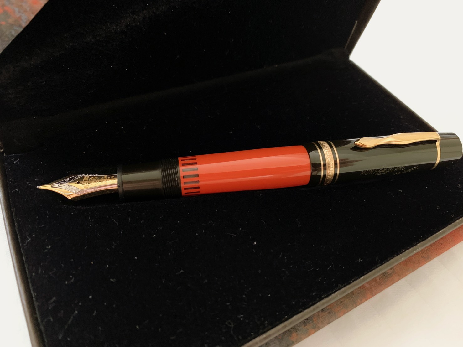
I bought another bottle of Kobe #51
etysmile.gif
etysmile.gif
etysmile.gif

 
I figured, why not. By the time I use up the two bottles...well, it'll be a long time until then. I've decided to dedicate a VP to #7 and #51 exclusively (with periodic breaks of Pilot BB and Diamine Midnight, I imagine), and keep it on the Techo. Given the 0.5mL per fill for the CON-50, I reckon it'll take ~200 fills for the two. Techo writing will typically finish that up in a week. So we're talking 200 weeks here
etysmile.gif

 
Oh, brother...I have 6 more bottles on the shortlist, and that'll probably be it for a good while.
 
Jul 30, 2016 at 8:56 PM Post #2,764 of 2,803
People are probably familiar with the Four Seasons line of inks from Sailor, which had replaced the previous standard line (Apricot, Epinard, Sky-High, etc). However, I imagine that a lot of the people that were not involved in the hobby pre-2010 might not have known that the Four Seasons were previously a limited edition release, and that there had been eight others colours released alongside what is now the current lineup. Well, rather, what had formerly been the current lineup. There had been a re-issue of the remaining eight sometime towards the beginning of this year, but from what I understood, it was going to be a one-time thing. Last month, Bruno from Cronica Estilograficas (great blog, got me started on my Japanese pocket/long-short pen collecting streak a while back) reported that they were being re-issued. I was initially confused as to whether he had been referring to the limited, one-time thing, or something else entirely, but as it turns out, it was the latter. It seems to be limited to the Japanese market at the moment, but it does appear to be a complete reissue.


I do like that the newly introduced colours add some much needed brightness to what was a fairly dark palette (Nioi-Sumire and Souten aside), but some of the lighter colours have been criticized as being too light for use in writing (Sakura-mori, Yuki-akari, Fuji-musume - in fact, the previous pink in the standard line, Peche, looks pretty much identical to Sakura-mori, and that was probably the least favourite out of the lineup for a lot of folks). I like the lighter colours myself.
 
I'm not too keen on collecting the whole lineup this time around. A lot of colours overlap strongly with existing inks in my collection. There are two that do not though (at this point in time): Chu-Shu and Rikyu-Cha.


Pictures all thanks to user Lgsoltek and their reviews on FPN.
 
 
Waka-Uguisu and Irori were enticing at first, but I will probably have Chiku-Rin coming in shortly to substitute for the former, and I have two 30mL bottles of Wild Strawberry to substitute the latter.
I've heard that Atsu (cool-japan) will probably be able to get these for you if you ask. I might bundle the two in with a Kobe purchase in the future (probably #14 and #34).
 
Jul 30, 2016 at 9:22 PM Post #2,765 of 2,803
On the topic of inks, I've noticed the Robert Oster line turning into the new hotness over on FPN. Some of the inks are fairly solid offerings, not unique by any means, but I can appreciate them for sure. There were a couple that struck me as being really nice, and fortunately, somebody had already compared three of them.

That user (migo984) has some good taste, to have picked the three that stood out the most for me, right off the bat :) They're also fans of the Kobe #51 - everything's come full circle.
 
Cyber6 has a 3-part review on the whole lineup here (1, 2, 3). Same review process as with the KWZ inks I had posted about a page back, so that's something to compare with.
 
On the topic of #51 - I've been noticing that Noodler's Blue Upon the Plains of Abraham could be a closer match than I had initially thought. The Noodler's looks to be a bit less dark, a bit less blue, more purple. Probably because of that prominent red component that comes off as sheen, whereas the Kobe sheens green and has a green component in the chromatography (you can also tell by the tinges of green that end up on your fingers). But still, fairly close.


Pictures from the Wonderpens Blog; they are also the only distributors of Blue Upon the Plains of Abraham, as it is a Canadian exclusive. Will stress that I have no affliation with them - they are on the other side of the country. It's just a good photo.
 
Although these pictures would not suggest that (being from the same reviewer too!). I imagine vis had a weird sample of the Noodlers. Heck, it looks closer to #7 in this shot.

(Left: Noodlers, Right: Kobe).
 
Speaking of:

(Thanks again to migo984)
 
This shot makes the Noodler's look closer to #51.
 
Jan 3, 2017 at 7:07 PM Post #2,768 of 2,803
I found a nice Christmas-y colour in Kyo no Oto's Azukiiro (Azuki referring to 紅豆, otherwise known as the red mung bean). A bit on the watery/dry side, so only Japanese mediums/Western fines should apply. I inked it up with a Pro-Gear at first, and while the colour was dusky enough, there was just no shading to be found, and lubrication was lacking. ​Threw it in an Eco (w/ a F nib) - much better, and it's fun to see the ink sloshing around because it really does look like red bean paste.


The colour in this picture is not a great representation of how it looks in real life -  a bit less red, more dusky. Rikyu-Cha below should have a bit more green to it too, for instance. Unfortunately that's the only picture of it that I took.
 
​This is a better picture (from FPN):

 
Jan 23, 2017 at 7:02 PM Post #2,769 of 2,803
After using old wet noodles and dip pens for a while I went back to the old Falcon SF. It felt so...stiff and unresponsive and lines were just so fat. I guess if I can put aside some money I'll see if that needlepoint nib mod for the falcon is any good. I think Greg Muskin as well as Mottishaw do them now. Until then I might order a janky jinhao to try and bodge a dip nib into.
 
On the other hand, I was using Diamine Sargasso Sea, I'd totally forgotten the amount of sheen this ink has. It's like a modern day Parker Penman Sapphire.
 
Jan 24, 2017 at 9:55 PM Post #2,770 of 2,803
I still enjoy writing letters with my twin metal Falcon pens - Purple ink in the Sapphire body, Blue ink in the Black body.

@ TwinQY
Great samples, great contributions as always!
 
Jan 25, 2017 at 8:46 AM Post #2,771 of 2,803
Since it's nice and sunny today here's a couple photos showing off that Sargasso Sea sheen.


It does bleed like mad on lower quality paper however, so coated stuff or more parchmenty paper is best.
 
Jan 26, 2017 at 4:14 PM Post #2,772 of 2,803
@Silent One: When I saw this ink, I immediately though of you. It being dry (at least on TR) is a bit of a shame. Oh well, Rikyu-Cha is close enough. Heck, it's a bit more green on TR still, so even better :)
 
Sargasso Sea is a bit too much for me. I've barely touched my 15mL bottle. Saturation and wetness is just excessive. Even bled through parts of TR paper. No staining to be seen, but I haven't used it in any pen for long. I thought I'd enjoy the colour, but Diamine Blue Velvet ended up a closer match to PPS. I have tried diluting SS, but it was not very fruitful - performance issues can be quelled (sort of), but the colour ends up rather dull, like a lesser Florida/Serenity Blue. Sailor Kobe #14: Maya Lapis is in the same family of blue, but much better behaved for me. Unfortunately my sample's out! Lucky for the Americans, the Kobe line is up on Amazon, with free shipping for Prime members.
mad.gif

 
I'm really digging KWZ Azure #5 as my main "blue" blue. There's a hint more green to it, but flow is generous yet controlled. Lubrication is phenomenal! I've had it in my P-G Slim all month, and that lovely vanilla smell to KWZ inks really matches with the white body. My picture of it a few posts up does it no justice. Sheen is comparable as PPS, SS, etc.
 
Jan 26, 2017 at 4:28 PM Post #2,773 of 2,803
​Speaking of Oster inks, I've got my tab with the Bauer Inks page pinned, I've got my Paypal ready...............
angry_face.gif


​Will probably just get Deep Sea though. I was worried that it would overlap with Syo-ro, but might as well live dangerously. And maybe a whole bottle of KWZ Grey Plum. I grabbed a 2mL sample straight from KWZ last month; lovely, lovely colour. There's a real depth to it when it's dried, that I've found with almost any nib width. From a juicy glass dip pen, to even a 823 w/ a F nib (dipped of course - I'm not going to waste a whole sample in a single fill!).
 
Feb 1, 2017 at 10:30 PM Post #2,775 of 2,803
​Anyone see this year's LE Lamys? Not sure about the rest of the world but Wonderpens in Canada seems to have gotten them in, well, at least the AL Stars 2017 LE - Pacific.

The colour suits the pen very well. I'm not sure if I'd like it in an ink. Thankfully I won't have to check to see if I do. Seems like the ink is just a repackaged Lamy Turqoise (http://www.fountainpennetwork.com/forum/index.php?app=forums&module=forums&section=findpost&pid=3780164) (can't embed links today for some reason). Saved me a trip to the local pen store. Although maybe I'll get a bottle of regular ol' Turquoise, just to be a contrarian.

​To be honest, I probably won't get the pen either. I like the looks of it but I've had my fill of AL-Stars. I used to overlook this because I was mostly in it for the looks and colours, but they were just too back-heavy when posted, and too unsubstantial when unposted.
 

Users who are viewing this thread

Back
Top